100 lines of code, 4 rectangles, 2 circles, 1 React SVG Loading Spinner
No one wants to make their users wait. What you want, is to provide the best experience possible like with a custom Loading component for example.
I really like the spinning loader on Meteor Development Group products. So much so that I actually dug into it to see how it was built. I found that it was built with a React component generating DOM elements (source code), linked to a bunch of complex, though super smart, CSS code (pre-processed with LESS (source code).

This post is a step-by-step tutorial to create a re-usable
LoadingReact component as cool as the one shown above rendering controlled SVG elements.

Don’t know SVG? No worries! 😄 I’ll show you how to manipulate shapes like circle and rectangles, as well as walk you through adding some cool effects like dashed borders and gradients. All that with JSX! ⚛️
Our playground: an <svg /> tag
The core of the code we’ll write will take place inside an <svg /> tag:
This <svg /> tag is our playground, whose area is controlled by a viewBox attribute. In our case a square of 120x120 — this is all we need to start creating our loading spinner. If you want to learn more about the viewBox attribute, I highly recommend reading this excellent article by Sara Soueidan.
The core shapes, or when the foundations lie on 2 circles
Let’s draw the base shapes of the loader using the <circle /> element:
A
<circle />element needs a radius along with X & Y coordinates of its center.
For example, we can draw a circle in the center of our component with a radius of 42 like so:

To get to something closer to the MDG spinner, let’s add another circle, make their backgrounds transparent thanks to the fill attribute. We’ll also customize their border, thanks to the stroke & strokeWidth attributes.
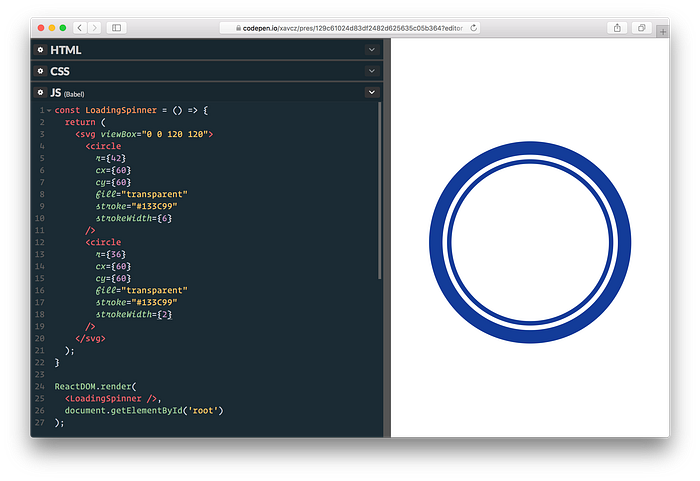
What’s up with these two shapes? On the one hand, we are missing the dashed border on the outer circle and on the other hand, the inner circle should just show an arc.
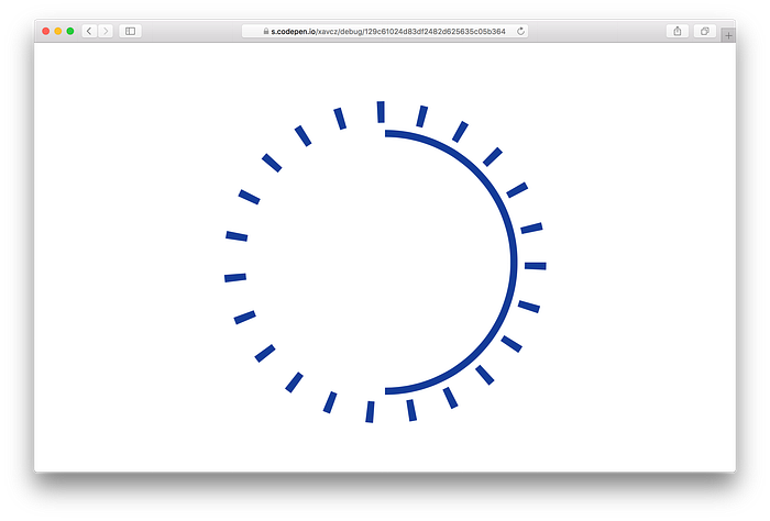
To get the outer circle to render as we’d like, we are going to use the strokeDasharray attribute to create a series of dash long by 2 and spaced by 9.5 to get a “nice dashed wheel”:
<circle
stroke="#133C99"
strokeWidth={6}
strokeDasharray="2 9.5"
/* ... */
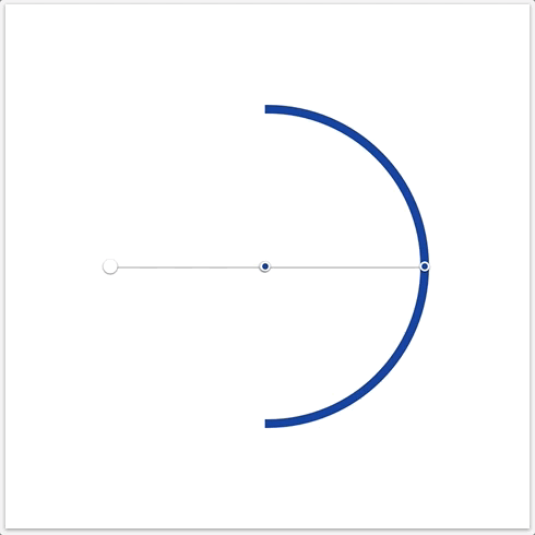
/>Considering the arc, also known as our half-of-the-inner-circle, we’ll hide half of it with a linear gradient: <linearGradient />! Linear gradients are made of stops: a stop defines where and how a color should change. We are going to use 4 stops to create a clear break between an invisible part and a filled part (of blue).
…uh? 🤔 A picture is worth a thousands words, isn’t it? May the GIF below explain what I mean by these 4 stops:
The code to generate such effect looks like this:
<linearGradient id="arc-gradient">
  <stop offset="0%" stopOpacity="0" />
  <stop offset="49.99%" stopOpacity="0" />
  <stop offset="50%" stopColor="#133C99" />
  <stop offset="100%" stopColor="#133C99" />
</linearGradient>
We make the first two <stop /> element transparent thanks to stopOpacity, and right when we are in the middle of the shape, we start with the color we picked for the spinner.
Note that the gradient has an id. The <circle /> will refer to the gradient thanks to this id! 🤝 Something like this:
<circle stroke="url(#arc-gradient)" /* ... */ />This is what we have so far:
The opacity effect, or when you make magic with 4 rectangles
If you take a closer look at the expected result, you’ll notice that the outer circle seems to step aside while turning. Mmmh… maybe we could apply some kind of gradient and play with the opacity like we have done with the arc? 🌀
This is what we are going to do: this is called an angular gradient… but there is no support for them in SVG land. “What?!” might have been your reaction reading this. No worries, we’ll elmuate the same view with 4 rectangles! 🎉
And SVG elements got us covered here:
// renders a rectangle of 60x60
// positioned at 0,0 in relation to the viewBox
<rect x={0} y={0} width={60} height={60} />
I got inspired by this awesome pen by Zachary Skalko where he generates 360 fancy rectangles to create this kind of conical gradient.

It’s pretty cool, but in our case, we don’t need to hammer the DOM with 360 rectangles, 4 rectangles is just enough for our simple spinner.
Our 4 rectangles will be almost transparent, but just visible enough to smoothly mask the parts of the outer circle we want to disappear. Here is a negative of what it will look like:
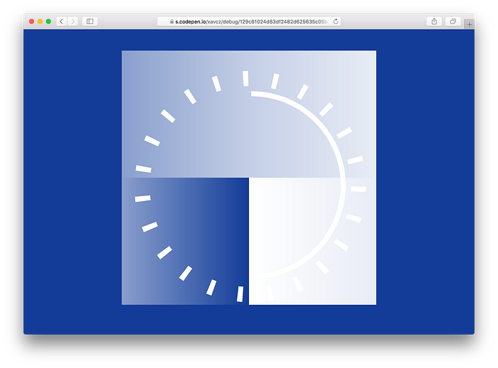
That means we need to create one gradient for each rectangle.
Assuming a rectangle takes 1/4 of the playground, we could describe where we want to go:
There are 4 squares/rectangles on the playground. A rectangle is a square of 60x 60. Each rectangle has a gradient associated. A gradient has a "start opacity" and an "end opacity". A gradient "starts" where the previous one "ended".
With these assumptions in mind, we could imagine an API for a component:
5 opacity stops going from 100 to 90, 75, 50 and finally 0 feels good. Here is a simple version of the code we need to render the 4 rectangle in our <LoadingSpinner />:
Success! We let optical gradient data on their own in an array, outside of our render method (they could come from somewhere else, who knows); and we also created a React component only made of SVG elements! 🙌
Here we are rendering arrays directly, this only work with React 16: prior to this version, you would have a to wrap two or more adjacent JSX elements in one element. React 16 is awesome, and not just because you can render arrays. I highly recommend checking out the official React blog, as well as the docs: both are gold mines of information and pleasant to read! 🤓
By the way, there is no z-index concept in SVG: the <OpticalGradient /> element position is therefore important! It is placed between the outer circle and the arc, so it’s over the outer circle & below the arc.
One CSS Animation to rule them all
La cerise sur le gâteau. 🍰
Time for the final touch: let’s make that spinner spin!
These keyframes are a love declartion to our LoadingSpinner component, and then once tied to our SVG elements, they will enter in motion.
We’ll use inline-styles to set elements spin 1 turn in 1.6 in a linear way so they will be able to repeat infinitely free of bumps. The outer circle is actually static, it’s the opacity effect driven by the rectangles that spins. The arc is animated in reverse direction so we get this pretty cool crossing-without-touching effect:
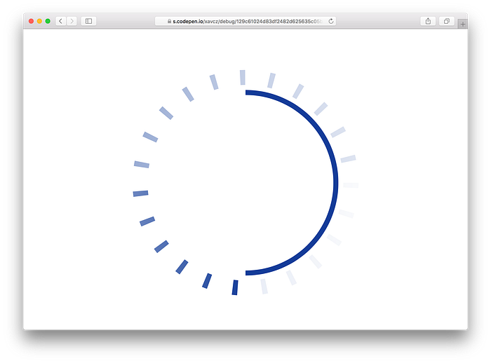
And here we are:

Holy cow! What’s happening here?! 😱
Hum… Well, the browser is actually doing exactly what we have told it to do: our spin animation is based on the transform CSS property. And with SVG elements, this property acts differently than with classic DOM elements. 😅 If you want to learn more about that, Ana Tudor wrote an excellent article on the subject, with comparisons between different properties, elements and browser!
To solve this (unexpected) issue, we are going to use the transform-origin CSS property:
- the arc needs to spin around its center (the center of the SVG)
- each rectangle needs to spin around the center of the arc (the center of the SVG)
Hopefully, we designed our SVG in a pretty simple way, a square of 120x120, so it’s straight-forward to get the absolute coordinate we want all element to spin around:
// abstract of the `style` prop
{ animation, transformOrigin: '60px 60px', }Aw yeah! 🌀 Ticking, spinning, resizing, loading, no matter what, this LoadingSpinner component definitely gets the ball rolling! 🎉
You can check the final result on this pen, which displays our LoadingSpinner alongside its original inspiration, (👏 to Dominic Nguyen for building it).
Let’s not forget that both components have their own set of trade-offs.
The SVG one has its styles encapsulated on its own, and could be even more if you use a CSS-in-JS, like styled-components 💅. But a full-fledged CSS solution may align with your current design system as it is for the original spinner.
The SVG one is also totally responsive, scalable vector graphics for the win; but may not render well on non-uniform backgrounds (the gradients stops use #fff in our example)!
In the end, I can only recommend to pick the solution that feels good, the one you like and fit with the scope of the project you are working on. I hope you’ve had a great time following / building this LoadingSpinner component, as I’ve had writing this post, my first tech tutorial.
If the SVG DOM was something obscure for you before, I also hope I’ve sparked your interest in experimenting and creating dope stuff with it! High five, let’s not be intimidated by the SVG DOM! 🖐
I’m Xavier Cazalot, @xav_cz on Twitter. I teach React (Native also) & GraphQL at OK GROW!, a consultancy based in Toronto, Canada.
Happy hacking! 🎩

Originally published at www.okgrow.com.

