A complete guide to CSS Modules in React (Part-2)
This is second installment of a two-part series on CSS modules. Check out the first installment here.

A quick recap: we know that when CSS is applied as modular CSS, the
class names are changed at the compile-time and are randomized in a way that creates no conflict with CSS used in a different module of your project.
Now, let’s deep dive into some of the common questions that a beginner faces
while using CSS modules.
How can we apply two class names at the same time?
Well, this question has a simple answer. You can just write the below syntax to
add 2 class names.
<button className = {`${ styles.submitButton} ${styles.outlinedButton}`} />Module CSS file:
.submitButton {
color : #008080 ;
background-color: white;
}.outlinedButton {
border-color: #008080;
}
The above code compiles to below HTML

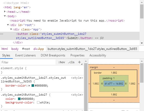
Carefully notice the syntax. The loader for CSS modules (the one you configure in webpack config and create react app configures for you) will replace the variables in the class name (styles.submitButton or styles.outlinedButton) with a randomized class name. So If you want to apply the two class names, you can use the template literal or you can use string concatenation. Template literal syntax just looks clean (this is my personal opinion).
Can I use combination selectors like .class1.class2 or .class1 > .class2 with modular CSS?
Yes with relative ease, the below example is self-explanatory:
styles.module.css file :
.submitButton {
color: #008080 ;
background-color: white ;
}.submitButton.outlinedButton {
border-color: #008080 ;
}
React component:
import React , { Component } from "react" ;
import styles from "./styles.module.css" ;export default class Button extends Component {
render () { return ( <button className= {`${styles.submitButton} ${styles. outlinedButton}`}>
Submit
</ button > ); }
}

Let's have a look at browser devtools for the same:
Can I use a modular class and a global class on the same element?
Yes, have a look at below piece of code:
filename : styles.module.css
.submitButton {
color: #008080 ;
background-color: white ;
}filename : global.css
.global-button {
border-color: #008080 ;
}react component :
import React , { Component } from "react" ;
import styles from "./styles.module.css" ;
import ‘./global.css’ ;export default class Button extends Component {
render () { return (
<button classname = {`global-button ${styles.submitButton}}>
Submit
</ button >
);
}
}
What the above syntax does is apply class submitButton without any modification as we are using it like a string constant and apply class global-button after modifying its name.
Note that the CSS file containing the class global-button (global.css) has to
be imported normally and not like a CSS module.
Let's have a look at devtools:

Can I use a modular class and a global class on the same element and apply a combination CSS selector?
Well, this is where it gets a little bit tricky. Like in our example above, if global-button is a class in global scope and is imported as import ‘./global.css’ and submitButton is a module CSS and you want to apply a style say for an element that has both .global-button and styles.submitButton, if you write .global-button.submitButton in either of the 2 CSS files, it fails. The reason is simple, submitButton class name is changed when the application is compiled and global-button is applied as it is.
So how do we apply this CSS in case of CSS modules?
:global in CSS modules: An Introduction
Anything that you write with a :global prefix in CSS module file is treated as a global CSS and it is included in the final CSS of your project without any name change.
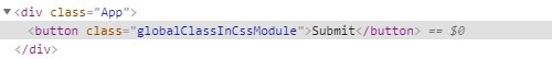
Let's see a simple example here:
filename: styles.module.css
:global(.globalClassInCssModule ) {
border: 2px solid green;
}react component:
import React , { Component } from 'react'
import styles from './styles.module.css'export default class Button extends Component {
render () {
return (
<button className= "globalClassInCssModule"> Submit </button>
)
}
}
Result and devtool:

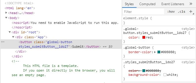
Lets say, if you want to apply CSS like .someGlobalClass.moduleCssClass
you can do something like:
filename : styles.module.css
.submitButton {
color: #008080;
background-color: white;
}:global(.global-button).submitButton {
color: red
}
filename : global.css
.global-button {
border-color: #008080 ;
}react component :
import React , { Component } from “react” ;
import styles from “./styles.module.css” ;
import ‘./global.css’ ;export default class Button extends Component {
render () {
return (
<button className={`global-button ${ styles.submitButton}`}>
Submit
</ button >
);
}
}
Above code will produce below output:

Let's see the applied CSS in devtools:
Let’s quickly touch upon another concept: composes keyword.
It is possible to compose classes in CSS modules. Let's look at an example of the same.
CSS file:
.submitButton {
  color : #008080;
  background-color : white;
}composedClass {
  composes : submitButton,
  border: 1px solid red;
  color : blue;
}
react component:
import React , { Component } from “react” ;
import styles from “./styles.module.css” ;export default class Button extends Component {
render () {
return (
<button className={styles.composedClass}>
Submit
</ button >
);
}
}

Conclusion
Well, that’s it from me for the CSS Modules series. Do let me know how you feel about the article in the comments section.
Want to explore more about modular CSS? Have a look at the documentation here: https://github.com/css-modules/css-modules

