Alignment with Flexbox
CSS Layouts using the Display Flex Properties
In this short video, I show how I use flexbox in everyday projects for things like a basic navbar or other content on your page. Switching the layout of a group of items from column to row format could require changing the display properties from block to inline, and then changing the spacing and alignment further after that change.
If the display property of a group of items, like a navbar is already set to flex, you can simply change the direction that they are flexing from column to row. Flex naturally takes care of the spacing between items with it’s ‘space-between’ and ‘space-around’ properties.
It may not seem intuitive at first, but while these small scale changes to something like a navbar are easy enough, flex also makes larger changes to the overall layout of a page equally as simple.
Flexbox is a powerful way to quickly align items on a page without having to use margins and padding to move things around. Flexbox really does all of the heavy lifting for you. In this video, I’m showing how you can create a navbar, and align it in different ways on the page using display flex.
Here are some of the basic alignment functions using flexbox:


Here are some of the main properties for display flex, as seen in css tricks
https://css-tricks.com/snippets/css/a-guide-to-flexbox/:
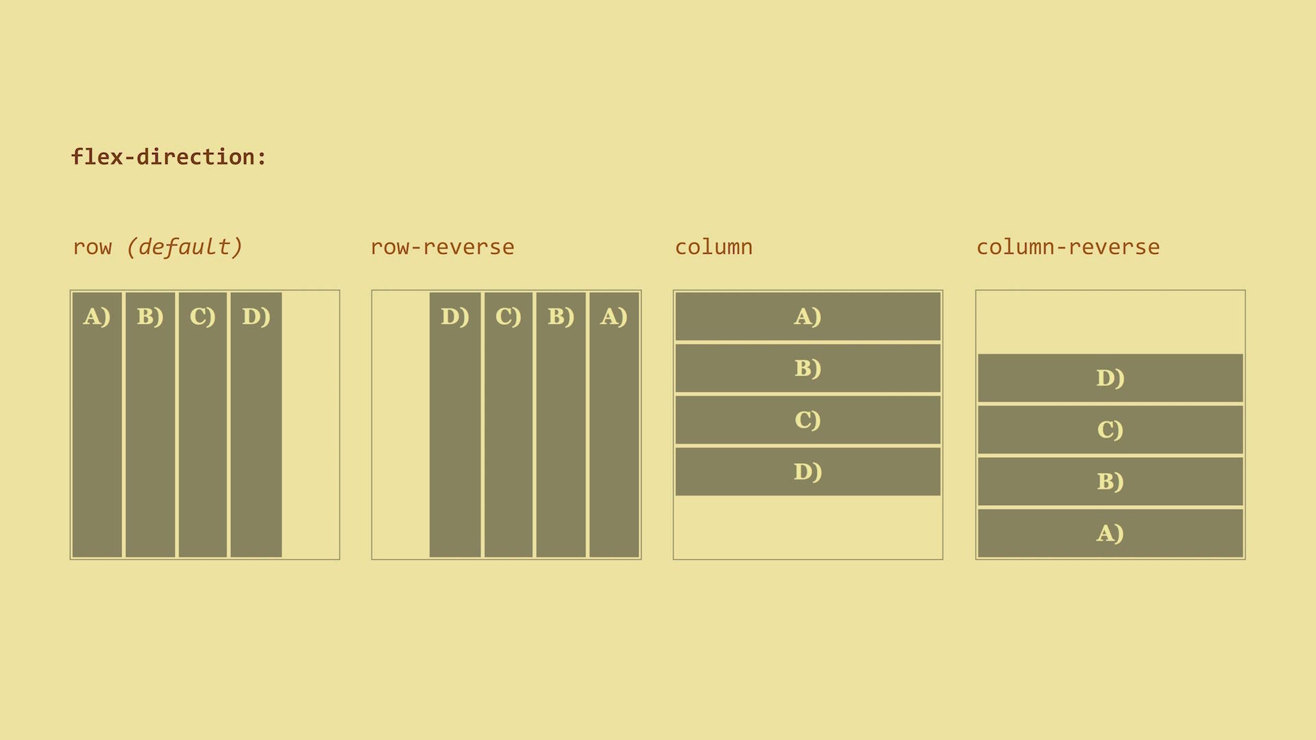
flex-direction: row | row-reverse | column | column-reverse;
row(default): left to right inltr; right to left inrtl
row-reverse: right to left inltr; left to right inrtl
column: same asrowbut top to bottom
column-reverse: same asrow-reversebut bottom to top
flex-wrap: nowrap | wrap | wrap-reverse;
nowrap(default): all flex items will be on one line
wrap: flex items will wrap onto multiple lines, from top to bottom.
wrap-reverse: flex items will wrap onto multiple lines from bottom to top.
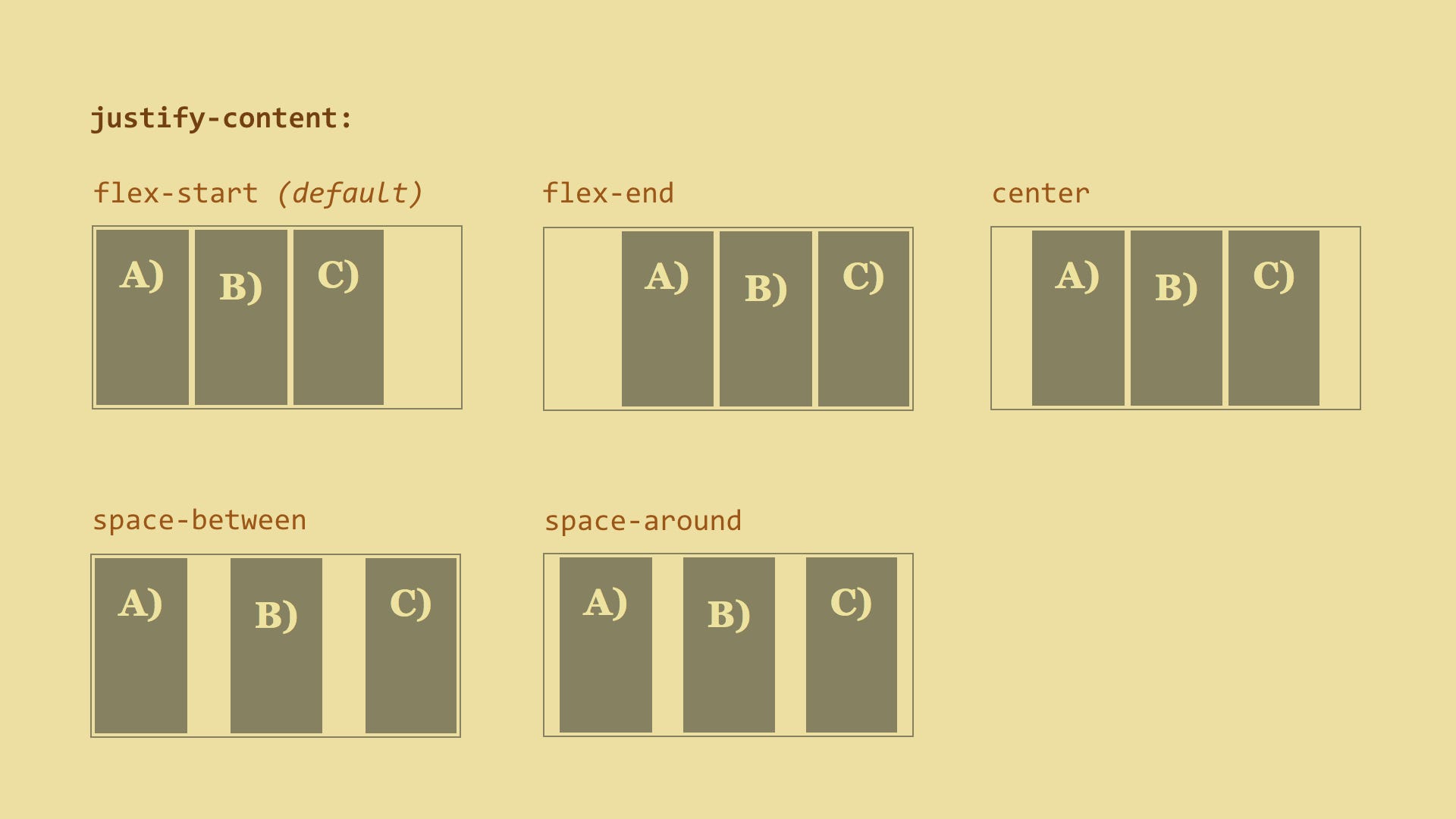
justify-content: flex-start | flex-end | center | space-between | space-around;
flex-start(default): items are packed toward the start line
flex-end: items are packed toward to end line
center: items are centered along the line
space-between: items are evenly distributed in the line; first item is on the start line, last item on the end line
space-around: items are evenly distributed in the line with equal space around them. Note that visually the spaces aren't equal, since all the items have equal space on both sides. The first item will have one unit of space against the container edge, but two units of space between the next item because that next item has its own spacing that applies.
align-items: flex-start | flex-end | center | baseline | stretch; }
flex-start: cross-start margin edge of the items is placed on the cross-start line
flex-end: cross-end margin edge of the items is placed on the cross-end line
center: items are centered in the cross-axis
baseline: items are aligned such as their baselines align
stretch(default): stretch to fill the container (still respect min-width/max-width)
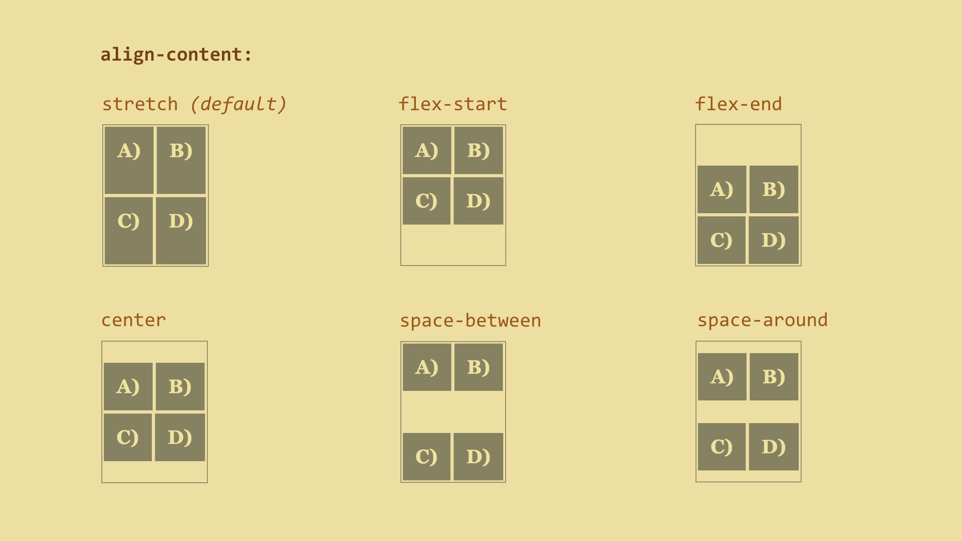
align-content: flex-start | flex-end | center | space-between | space-around | stretch;
flex-start: lines packed to the start of the container
flex-end: lines packed to the end of the container
center: lines packed to the center of the container
space-between: lines evenly distributed; the first line is at the start of the container while the last one is at the end
space-around: lines evenly distributed with equal space around each line
stretch(default): lines stretch to take up the remaining space

