Ant Design by Example: Part 1
We explore the Ant Design (React) library through example.

Historically, I have avoided using React-based design libraries. My reasoning was (and continues to be) that I did not want to use libraries that provided an interpretation of another specification; for example Material-UI with Material Design and React-Bootstrap with Bootstrap. Ant Design is different; it itself is a specification (the official version is the React library).
Ant Design is used heavily in China; having some large companies using it e.g., Alibaba. As an open source project, it has relatively few issues, a lot of recent activity, and over 24K stars (a lot considering that React has 88K).
All of the examples in this series are available for download.
Getting Started
The project provides complete documentation (I was successful in following them) on using Ant Design with Create-React-App. The documentation, however, is insufficient if you manage your own build, i.e, write your own webpack configuration. Thought to document my experiences.
My environment is:
- Node.js: v8.9.4
- Yarn: v1.3.2
My starting point webpack configuration (based on webpack v3.6.0) is documented in a separate series or articles starting with webpack By Example: Part 1.
note: Obviously, we are not going to use any of the scaffolding tools like the recommended dva-cli; we are already managing our own build.
Buried in their documentation (and examples) is the requirement to use the Moment.js library (parsing and managing dates and time). We install it with:
yarn add momentand initialize its locale in:
started/src/index.jsx
...
import moment from 'moment';
import App from './components/App';
import './index.css';moment.locale();
...
We install the antd library.
yarn add antdThe documentation suggests that can use the library by simply importing the components and styling as follows:
..
import Button from 'antd/lib/button';
import 'antd/lib/button/style'; // or antd/lib/button/style/css for css format file
...
Apparently, they assumed that we were using less-loader and that we use globally scoped CSS; neither are true in my starter build. My first pass at this was to re-configure webpack to import CSS from node_modules as globally scoped CSS and use antd’s CSS option.
started/webpack.config.js
...
module.exports = (env) => {
  const globalCssLoaders = [
    {
      loader: 'css-loader',
      options: {
        sourceMap: true,
      },
    },
  ];
...
{
  test: /\.(scss|css)$/,
  exclude: /node_modules/,
...
{
  test: /node_modules\/.*\.css$/,
  use: env.NODE_ENV === 'production' ?
    ExtractTextPlugin.extract({
      use: globalCssLoaders,
      fallback: 'style-loader',
    }) :
    [
      {
        loader: 'style-loader',
      },
      ...globalCssLoaders,
    ],
},
...
And then use the Button component as follows:
started/src/components/App/index.jsx
import React, { Component } from 'react';
import Button from 'antd/lib/button';
import 'antd/lib/button/style/css';
...
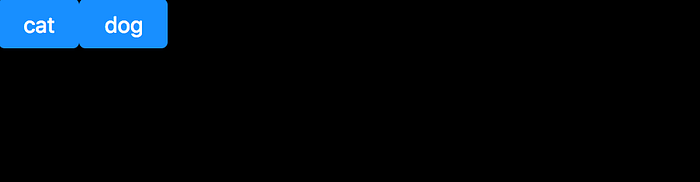
<Button
type="primary"
onClick={() => { this.setState({ showing: 'cat' }); }}
>cat
</Button>
<Button
type="primary"
onClick={() => { this.setState({ showing: 'dog' }); }}
>dog
</Button>
...With a successful result:
Simplified
Because this library uses a particular pattern of importing components (the specific component and associated style), we can additionally use the babel-plugin-import library to simplify the import.
note: babel-plugin-import is supported by the same folks that support the antd library.
Starting from the previous example, we run:
yarn add babel-plugin-import --devand then update:
simplified/.babelrc
{
  "presets": ["es2015", "react"],
  "plugins": [
    "syntax-dynamic-import",
    [
      "import",
      {
        "libraryName": "antd",
        "style": "css"
      }
    ]
  ]
}
With this in place, our import is simplified to:
simplified/src/components/App/index.jsx
import React, { Component } from 'react';
import { Button } from 'antd';
import asyncComponent from '../asyncComponent';
...
Next Steps
In the next article, Ant Design by Example: Part 2, we explore customizing Ant Design.
