Autocomplete Select Inputs on Mobile
Exploring issues of autocomplete select inputs on mobile; first by defining it and then recommending an implementation.

note: I wrote a separate article, Autocomplete Select Inputs on React Native, that provides a concrete implementation.
Select Inputs
Let us first review what a regular select input, aka., drop-down list, is and how it behaves on mobile. We use the HTML select tag as our reference example. On the desktop, (macOS), it looks like this:

On iOS (iPhone) it looks like this:

On Android it looks like this:

Observations:
- In each case, the input’s behavior is modal, .i.e., you must make a selection (or cancel)
- The mobile interfaces are significantly different from the desktop interface
Autocomplete Search Inputs
The autocomplete search input, popularized by Google, provides suggestions based on the user’s entry.

In this case, mobile examples essentially look like the desktop version, e.g., on iOS:

Observations:
- Select inputs often have a fairly limited list of options; otherwise they become unwieldy. Autocomplete search inputs have a virtually unlimited list of options
- Unlike the select inputs, the behavior is not modal, e.g., the list is only a suggestion to a free-form input field
- Also, “The mobile autocomplete is particular difficult to get right as the user interface suffers from an already small screen on mobile, combined with the user’s touch keyboard being shown at the same time (taking almost 50% of the screen).” — 37 annotated “Search Autocomplete” Design Examples
- In all the examples above, the single autocomplete search input is a fixed element at the top of the screen. The options use of all the remaining available space below the autocomplete’s text input
Autocomplete Select Inputs
The autocomplete select input, as the name suggests, is a hybrid of a select and autocomplete search input. A classic example of this is selecting the origin and destination for flights, e.g., Google Flights on the desktop:

On iOS (iPhone) it looks like this:
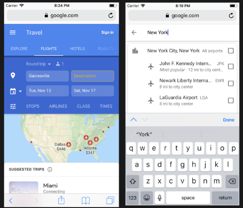
Observations:
- Like the select input, the mobile interface is significantly different from the desktop interface; in this case a completely separate screen
- Like the select input, there are often more than one of them, e.g. origin and destination, on the screen (and they may not appear at the top of the screen)
- Like the select input, the behavior is modal, .i.e., you must make a selection (or cancel)
- Like the autocomplete search inputs, autocomplete search inputs have a large list of options
The Challenges of Drop-Down Lists On Mobile
Having done more desktop (than mobile) web development, my first attempt at an autocomplete select input was to build a drop-down list.
The first and hardest challenge to overcome is the limited amount of screen space available on mobile. Imagine that we were to build a drop-down list for destination in the Google Flights mobile interface.
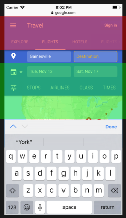
Observations:
- The screen navigation (highlighted in red) is fixed; if we hid this section we would have essentially created a modal example
- Even with scrolling the input to just below the screen navigation, we have a limited amount of space to list the options (highlighted in green)
Also, often the autocomplete select input is on a scrollable screen, e.g., the Google Flights example. In this case, we are nesting a scrollable object (the list of options) inside a scrollable object (the screen). On mobile (small screens and touch interfaces), it is hard to determine how to scroll each of the overlapping scrollable objects.
Wrap Up
Bottom line, for mobile the approach used by Google Flights (navigating to a new screen) appears to be the best approach for autocomplete select inputs.
