Build a Minimalist HTML Card in just 53 lines of code (with Flexbox)
Flexbox provides a more efficient way of laying out, aligning, and distributing items in containers. Today I’ll be showing you a practical Flexbox example: Learn How to make minimalist, elegant, HTML cards in just 53 lines of code.

Hold up
Quick side note: this is not a Flexbox tutorial. With that being said, if you’ve never used Flexbox before, that’s OK! You’ll still be able to follow along and understand what is going on. Just know that I’m only going to be showing you about 1% of what Flexbox can do. If this topic interests you and you want to learn Flexbox, check out Two awesome Flexbox courses you can start today.
Lets build
For this tutorial you only need two files: an index.html and a linked index.css file. You can see my code for this project on the GitHub Repository. If you’d like, you can build your project in a new Codepen instead. Once you’ve decided where you want to build, lets get started with our HTML.
HTML Structure
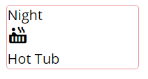
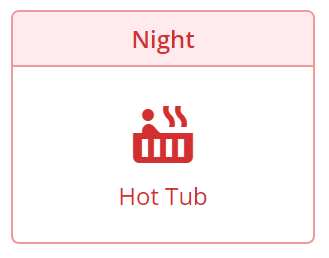
First, we’ll structure the HTML for our card. Looking at each card, there are five common components. I’ve illustrated them in the diagram below:

card: Our parent component that houses two child components, theheaderand themain section.header: This component holds all of the heading HTML.main section: This component holds two child components, theiconand thedescription.icon: This component houses our Google icon.description: This component houses the main sectiondescription
With this in mind, we’ll create appropriate class names, and use nested div elements to structure our HTML. Here’s what that should look like:
As you can see, we’re also using Google’s Material Icons for this project. Seriously, check them out. They have hundreds of cool designs you can use in your projects for free.
We’re also using Google Fonts. I’ve chosen a simple sans font, Open Sans, to make our cards look simple and clean.
Lastly, like in the image above, we have five nested components ( div ).

CSS & Flexbox
Now the fun begins! How do we get our plain and boring card to look good?
Step 1: Apply Google Fonts.
Lets apply our imported Open Sans font to the entire body of our project:
body {
  font-family: 'Open Sans', sans-serif;
}
This code specifies that we want to use the Open Sans font we imported from Google as our body's default font family. If that font isn’t available (like if there was an error requesting it from Google), we will use the users built in sans-serif font instead.

Step 2: The Card
There are seven styles we’re going to apply to our card div:
- The width of our cards will be set at 150px.
- The border will be 1 pixel, solid, and a red color.
- The border edges will be curved ever so slightly.
- We’ll make sure the content of our card doesn’t overflow over the curved border edges
- We’ll set up Flexbox for our two child elements. This is done by setting
displaytoflex. This sets up the childdivelements to use Flexbox. - By default, Flexbox works along the horizontal axis. By changing the
flex-directiontocolumn, we can rotate the default horizontal axis of Flexbox to a vertical axis. This will align our childdivelements vertically.
.card {
  width: 150px;                 /* Set width of cards */
  border: 1px solid #EF9A9A;    /* Set up Border */
  border-radius: 4px;           /* Slightly Curve edges */
  overflow: hidden;             /* Fixes the corners */  display: flex;                /* Children use Flexbox */
  flex-direction: column;       /* Rotate Axis */
}
Step 3: The Header
There are seven styles we’ll need to apply to our card-header element:
- Text Color will need to be a dark red
- We want our Header text to be aligned in the center
- We want our font size to be set at 12 pixels
- We’ll change the
font-weightto make our header bolded - We need to set a bottom border to our header which will match our outer
cardborder. - We’ll set the background color of our header to a light red color
- We’ll add some padding to our Header text to ensure the text looks centered and doesn’t run into the border
.card-header {
  color: #D32F2F;
  text-align: center;
  font-size: 12px;
  font-weight: 600;
  border-bottom: 1px solid #EF9A9A;
  background-color: #FFEBEE;
  padding: 5px 10px;
}
Step 4: Main Card Content
There are five styles we need to apply to our card-main element. Our card-main element is also the parent element for two of our other elements, so we’ll be making use of Flexbox to help style the inner elements.
- We’ll set up Flexbox for our two child elements.
- We’ll rotate the default horizontal axis of Flexbox to a vertical axis. This will allow us to align our children on the vertical axis.
- Use Justify content to center our two children along our vertical axis.
centerprovides equal white-space above and below our two Flexbox elements. - Use Align-items to center our two children along the cross axis (in this case the horizontal axis).
centerprovides equal white-space to the left and right of our tow Flexbox elements. - Lastly, we’ll add a little padding to the top/bottom to space things out
.card-main {
  display: flex;              /* Children use Flexbox */
  flex-direction: column;     /* Rotate Axis to Vertical */
  justify-content: center;    /* Group Children in Center */
  align-items: center;        /* Group Children in Center (+axis) */
  padding: 15px 0;            /* Add padding to the top/bottom */
}
Step 5: Icon Styles
We only have to make minor changes to our Google Icon. We’ll just increase the size, change the color to match our header text color, and add a small bottom margin to space things out a bit.
.material-icons {
  font-size: 36px;
  color: #D32F2F;
  margin-bottom: 5px;
}
Step 6: Description Styles
All we have left is to change the color and size of our description text, and align it in the middle of our card.
.main-description {
  color: #D32F2F;
  font-size: 12px;
  text-align: center;
}
Final Code: HTML & CSS
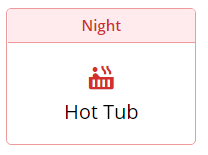
You did it!
Here’s what all of our css should look like:
You did it.
Good work! You can now make your own minimalist, yet elegant HTML/CSS Cards. I publish a few articles/tutorials each week, please enter your email here if you’d like to be added to my once-weekly email list.
❤ If this post was helpful, please hit the little blue heart! And don’t forget to check out my other recent articles:
- Two awesome Flexbox courses you can start today.
- And when you’re ready to really dive into Web Development, Check out the 5 Best Courses for Learning Full Stack Web Development


