Building an Awesome UI Component Library in 2020
How to build your team’s next-gen component library in bit.dev, with real React component examples!

Working in a team that is building a few apps and the time has come to consider building your UI component library? In this post, I’ll show how to quickly grant your team a next-gen UI component lib with enhanced features.
Component libraries are a great way to leverage the modular and reusable nature of UI components (React, Vue etc). It lets your team share these components across projects, save time and keep your UI consistent.
“If a component library is like a music CD-Album, then bit.dev is like iTunes or Spotify for UI components.”
Just like music CD-Albums transitioned from static CD-Roms into dynamic iTunes and Spotify playlists, in 2019 UI component libraries took to the cloud with the introduction of bit.dev dynamic reusable component collections.
In this post, we’ll quickly go through how you can create your team’s own UI component library today, begin reusing components, and gradually grow your component collection over time by adding more components as you go.
Quick-intro to bit.dev component libs

Bit.dev is a fast, dynamic and collaborative way to build your team’s component library. Put together with GitHub project Bit, it lets you gradually extract and collect existing components into a dynamic library that your team can share, reuse and collaborate on. And, it requires very little setup or overhead, if at all. You can learn more about it here.
Some key advantages of using bit.dev’s “iTunes-like” component library:
- You can build it gradually without losing focus.
- Very little setup of configurations overhead.
- Efficiently organize and segment components: labels, size etc.

- Write code, generate stunning docs and save rendered examples.
- A component registry built-in your library.
- Dynamically reuse and update standalone components. Deliver meaningful updates.
- Let teams modify components to share code but stay independent.
- Keep all Git repos in perfect sync.
You can learn more about it here. And you can check out Bit on GitHub here.
So you have a React app with some components…
So let’s assume that you are working as a part of a team that is building a Netflix-like movie application. Let’s call this application an “awesome movie app”. This application isn’t even state of the art, it’s a bit old, styling isn’t really that modular, and it uses an older version of React.
Here is your app:
Now, your team began working on a couple of new applications. To ensure UI consistency and speed development, you have been asked to look into building your team’s component library.
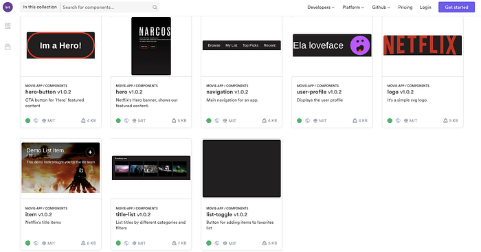
One of your options is to use bit.dev to create your library. Eventually, it will look like this. Each component can be easily found, reused, modified and updated across your projects. Your team can reuse the components to ensure consistency and save precious development time.
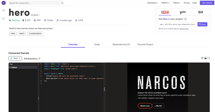
And, here’s the “Hero” component that can be installed right from within your bit.dev library via your npm/yarn client. It can also be imported using bit to make modifications and update the version. Note that tests have run in isolation (Bit did that for us) and examples are extracted and presented.
But, how do we get from the point that all the components are internal to our app to the point where they are all available as a reusable “playlist-like” library in bit.dev? Let’s quickly see how this gradual workflow works.
Create your bit.dev library and add the components!
Remember we said that you can gradually collect existing components into a dynamic library? well, let’s put it to practice with the movie-app example.
We’ll go through this in 3 rather simple steps.
Step 1 — Track and isolate components in your app
Let’s start by cloning the React movie-app example we created. Try hard to pretend that it’s your real team’s app 😆
$ git clone https://github.com/teambit/movie-app.git
$ cd movie-app
Next, install Bit and init it for the app we just cloned.
$ npm install bit-bin --global
# or
$ yarn global add bit-bin$ bit init
successfully initialized a bit workspace.
$ npm install
As you can see, the app has a bunch of UI components under the src/components directory, including logo, item and here. Let’s use the bit add command to point bit to all the components inside this directory, so it can analyze them and pack each with its own reusable environment. You will see that a package.json file is automatically generated for each component :) We’ll also use the -t flag to point Bit to component unit-test files, which Bit will later run in full isolation outside of the app, to ensure true reusability.
$ bit add src/components/* -t 'src/components/{PARENT}/*.spec.js'
tracking 8 new components
Now run a quick bit status command and learn about the isolation status for each of the components! ✨
$ bit statusNext, let’s also bit add the styling components from the app.
$ bit add src/global.css --id style/global
tracking component style/global:
added src/global.css
Next, instead of having to configure the build/test setup of every component, just import a reusable component dev environment from the official collection. Bit will use these pre-defined configs to build each component in isolation outside of the project, to ensure it’s reusability. In this case, let’s bring in the React compiler environment and the Mocha testing environment:
$ bit import bit.envs/compilers/react --compiler
the following component environments were installed
- bit.envs/compilers/react@1.0.6

$ bit import bit.envs/testers/mocha --tester
the following component environments were installed
- bit.envs/testers/mocha@5.0.2
Now Bit linked all the components in your workspace to these environments. Run a quick bit build or bit test to see how Bit builds and tests your app’s components in 100% isolation outside of your project…
That’s it! All that’s left now is to tag a version for each component and export all of them to bit.dev! Let’s quickly see how.
Step 2- Tag and export components to bit.dev
Versioning individual components mean you can later update a single component and all its dependants together, but without having to deliver redundant updates to components you don’t use, running CI for the entire app for no reason at all. Useful, right?
Let’s use bit tag to set all components in the app to version 1.0.0.
$ bit tag --all 1.0.0
...9 components tagged | 9 added, 0 changed, 0 auto-tagged
added components:  style/global@1.0.0, hero-button@1.0.0, hero@1.0.0, list-toggle@1.0.0, item@1.0.0, logo@1.0.0, navigation@1.0.0, title-list@1.0.0, user-profile@1.0.0
Now quickly head over to bit.dev, sign-up for free and create a collection. This collection is like a scoped library for a certain app, team or feature. Then, quickly run bit login to authenticate your local workspace to bit.dev
$ bit loginAnd after authenticating, just bit export the components to your collection!
$ bit export <UserName>.<collectionName>
exported 9 components to collection userName.collectionName
Head over to your collection and check it out…. 💪
The components, which up until 10 minutes ago were internal to your app, are now a part of a dynamic library your team can reuse anywhere!
Step 3- Install or import components
Now head over to your newly-created library on bit.dev. Note that you can now filter components by labels, size (bundle-weight), tests etc.
Choose the “Hero” component and click on it (example).
You can see a few things:
- You can play with the component in a live sandbox playground, save examples and share them with others.
- You can view the component’s code, dependencies etc via tabs.
- You can view the output of the unit-tests results that ran in isolation in the bit.dev component CI feature.
- You can see docs auto-extracted from the code (in more modern cases a prop table will be parsed and presented).
- You can install the component using npm/yarn from the bit.dev registry or use bit to import and modify the code (which can be a version update).
To install the component, look at the right-side pane with the npm logo.
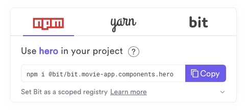
Simply copy the npm/yarn command and install the component in any new project you are working on! When there’s an update, you can pull it in without having to update other components that are not impacted by the change.
If you want to make changes to the component from a new project, create a new project. Then head over to bit.dev and click on the Bit logo and copy the import command to use in your new project.

Bit will bring the component’s actual source-code, while tracking code-changes and version updates. Now you can simply access the component in the project, make changes to the code, and bit tag a new version. Then, run bit status to see that all is well, and bit export the new version.
The new version will be now available in bit.dev. You can now bring in the changes and update the component in any project by using bit checkout. Just read the short docs section and you’re good to go.
What just happened?
Well, we had a few components internal to our app. We wanted to add them as part of a new component library for our team to share and reuse.
In a few minutes, we isolated the components from the apps and shared them as standalone reusable units to our bit.dev dynamic library! Now our team can share and reuse these components, and gradually add more components on the fly- without losing focus on building our apps.
We now have docs+rendering+registry for the components out of the box, built in the library, so we don’t need to maintain any additional toolchain. Each component can now be easily found, used and even modified right from any new app we’re working on. Our dev team can build faster, and our users will get a fast and consistent experience that will make them a bit happier.
In the next weeks/months we can just gradually export more components to our collection, and scale it as our frontend team and scope of work does.
That’s it! I hope you enjoyed and please do feel free to comment below and ask anything. Cheers and happy coding! 🍻

