Create Unique Web Experiences with CSS Custom Cursors
In only 5 minutes

I had dinner, then sat like a heavy duck skimming through some cool websites. I don’t remember how I got there, but the next 20 minutes were spent surfing through a particular website.
A couple things were super cool about the Mutt Agency website, but I was really blown by the clever use of custom cursors.
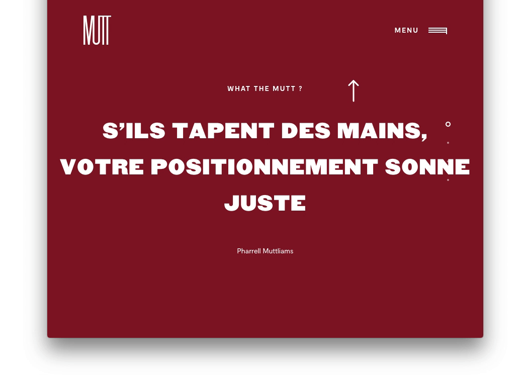
From the GIF above, the cursor changes to point to the top navigation when you move away from the main content on the screen.
How Easy is to Rebuild This?
The brain behind this is a simple one-liner.
.my-awesome-selector {
   cursor: url(../path/to/awesome/icon.svg), cursor)
}
Can you Give a Better Explanation?
What better way to explain this than to code the nice effect together?
Put your dev hats on!
1. Go over to codepen.io and create a new pen
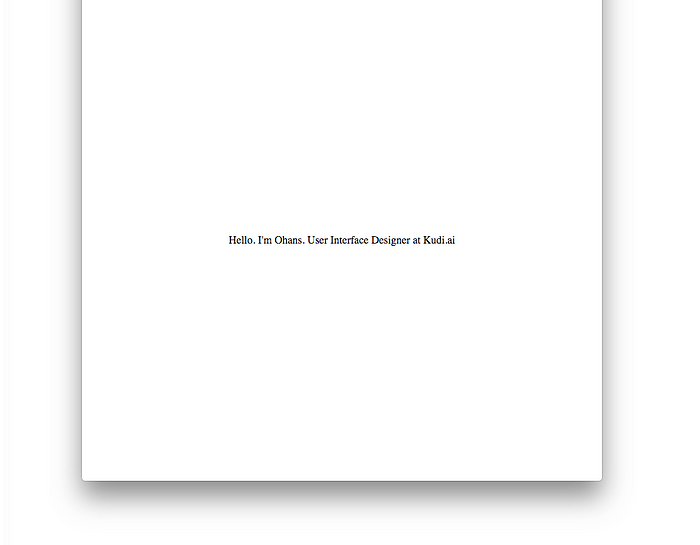
We’ll build a little portfolio page beginning with the markup below:
<main>
  Hello. I'm Ohans.
  User Interface Designer
  at Kudi.ai
</main>
So far, so good.
Really?
There’s nothing to be excited about — yet.
2. Position the main content in the centre of the screen. Flexbox to the rescue!
body {
 display: flex;
 justify-content: center;
 align-items: center;
 min-height: 100vh;
}
Here’s how that works:

Below is the result of the code above:
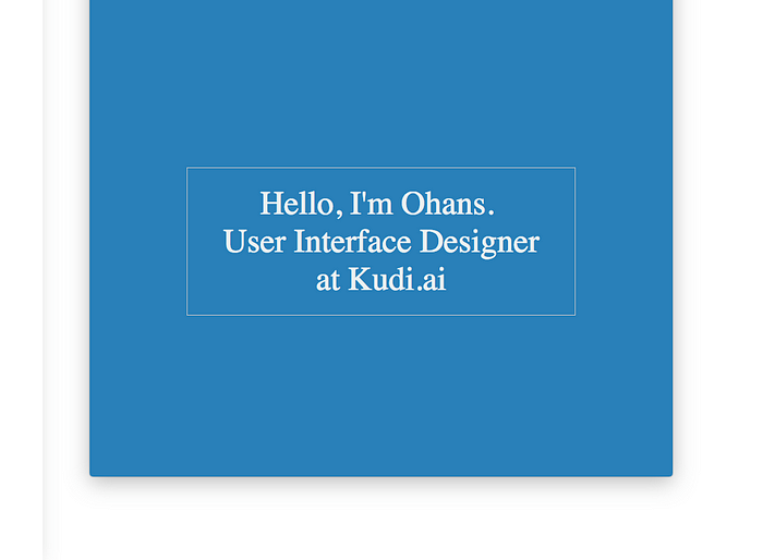
3.Let’s make this beautiful.
Each time you create an ugly app, someone dies. No, not really. Let’s make this beautiful.
body {
   …
   background-color: #2980b9;
   color: #ecf0f1;
   font-size: 3em;
   text-align: center;
}main {
   border: 1px solid #bdc3c7;
   cursor: pointer;
   max-width: 60%;
   padding: 1.5rem 2rem;
}
Pretty simple stuff, huh?
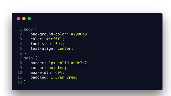
For the uninitiated, max-width will set a maximum width on the applied element. Yes, you guessed right. padding: 1.5rem 2rem sets the padding on the element via the padding shorthand. The top and bottom padding will equal 1.5em, the left and right padding value will be equal to 2rem.
Here’s the result of that:

4. We need a little more markup
Okay, I lied. When I said we didn’t need extra markup, that was me acting drunk. We need a little more markup. I’ll tell you why soon.
<main>
  <div class="main_hover-up"></div>
  Hello, I'm Ohans. <br />
  User Interface Designer
  at Kudi.ai
  <div class="main_hover-down"></div>
</main>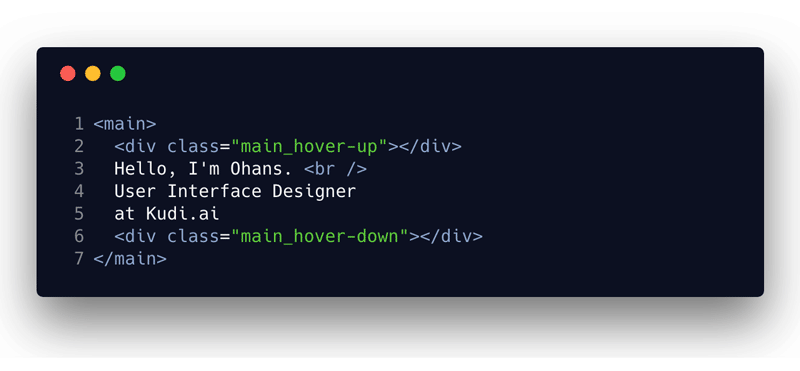
We will capture the user’s mouse interactions with the .main_hover-up and main_hover-down elements. But first, we need to make them visible and positioned righty.
5. Set up a positioning context within main
main {
 position: relative;
}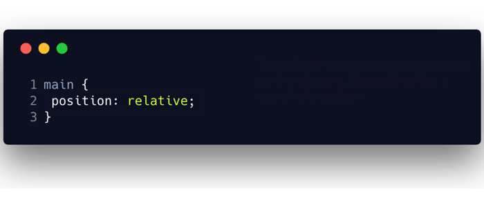
With the positioning context set, we can go ahead to position the child elements with the top, bottom , left and right keywords.
6. Position and Style the elements to capture the mouse interactions
.main_hover-up,
.main_hover-down{
  position: absolute;
  top: -102%;
  left: 0;
  height: 100%;
  width: 100%;
  transform: scaleX(2);
  transform-origin: 50% 100%;
  background: red;
}
.main_hover-down {
  top: 102%;
}
I know. That is a lot to add at once, but below is a rundown of how it works.

If something isn’t clear, feel free to reach out in the comment section. I’ll be happy to help.
And here’s the result of that.

Red backgrounds. Really?
I know you didn’t come this far to have an ugly red box staring at you. Let’s make those transparent.
.main_hover-up,
.main_hover-down {
 background: transparent
}
A smarter thing to do is to delete the former background: red declaration. By default, elements have an initial background-color of transparent.
7. Now, get the custom cursors in there!
.main_hover-up:hover {
  cursor: url(http://bit.ly/2DfPhcj), pointer;
}
.main_hover-down:hover {
  cursor: url(http://bit.ly/2GaJR5q), pointer;
}
Now, as you move up, leaving the main content area, you’ll be pointed up to the navigation area. As you move down, you’ll be pointed down — indicating there’s more content below.
Pretty darn cool!
How does this affect User Experience?
Except you know what you’re doing, don’t go about making disturbing custom cursors. Okay?
In this particular case, the user experience doesn’t suffer. The user isn’t carried away by some fancy GIF cursor. Instead, a custom cursor has been used to aid the navigation around the site. Great!
Oh, it didn’t work for me.
If you’re experiencing any errors with using an SVG as a custom cursor, be sure to check the dimensions. Keep it small. Maximum of 128px * 128px Also, check that your SVG has width and height dimensions intrinsically - as opposed to using only the viewbox
Ready to become Pro?
I have created a free CSS guide to get your CSS skills blazing, immediately. Get the free ebook.


✉️ Subscribe to CodeBurst’s once-weekly Email Blast, 🐦 Follow CodeBurst on Twitter, view 🗺️ The 2018 Web Developer Roadmap, and 🕸️ Learn Full Stack Web Development.

