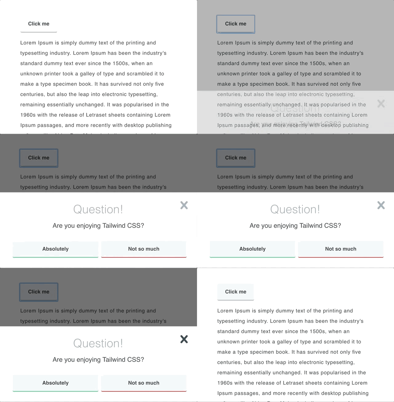
As I’m exploring, learning and using the recently released Tailwind CSS “utility-first” css framework I wanted to share some of my learnings to hopefully help others get a better understand of the framework.
This example demonstrates how to create a basic modal dialog overlay using Tailwind CSS. It assumes some prior knowledge of HTML, Tailwind CSS and Javascript.
Extending Tailwind
In order to create an overlay effect by darkening out the webpage content we need to have a wrapper for our Modal with a semi-transparent background. As of writing this, Tailwind doesn’t have a default variable for this so I created a new set of colour options called smoke.
var colors = {
...
'smoke-darkest': 'rgba(0, 0, 0, 0.9)',
'smoke-darker': 'rgba(0, 0, 0, 0.75)',
'smoke-dark': 'rgba(0, 0, 0, 0.6)',
'smoke': 'rgba(0, 0, 0, 0.5)',
'smoke-light': 'rgba(0, 0, 0, 0.4)',
'smoke-lighter': 'rgba(0, 0, 0, 0.25)',
'smoke-lightest': 'rgba(0, 0, 0, 0.1)',
...
}
Simply recompile Tailwind to generate the new colour variables.
Semi-transparent overlay
Next we can define the wrapper. We want this to fill the entire viewport and center align the content, both vertically and horizontally. All of this is really easy to do in Tailwind and Flexbox.
<div class="fixed pin z-50 overflow-auto bg-smoke-light flex"></div>
Each class is quite self-explanatory …
fixed pinpositions the div absolute and pins it to all corners filling the entire screenz-50makes sure it is top-most in the z-order to position it above other elements on the pageoverflow-autoallows scrolling if the modal is bigger than the viewportbg-smoke-lightis our new semi-transparent background colourflexmakes it a Flexbox container so we can easily align/position the content
The dialog box
Now we are ready to actually create our dialog box to display our message and call-to-actions.
<div class="relative p-8 bg-white w-full max-w-md m-auto flex-col flex"></div>
There’s a little bit more going on here so let’s break it down again:
relativepositions the document in the normal flow of the pagep-8 bg-whiteadds some padding to the dialog and gives it a white backgroundw-full max-w-md— I like this one. This makes the dialog full width but never let’s it grow more than the medium break point. You could take this one further and for example make the dialog full-screen on mobile devices by addingh-full md:h-auto. Themd:are responsive helpers provided by Tailwind to only apply classes at specific breakpoints. Neat.m-auto flex-colsets all margins to auto to center the dialog.flexgives us flexbox control over elements inside. E.g. to align our buttons.
A close button/icon
Finally, let’s add a close button in the corner.
<span class="absolute pin-t pin-b pin-r p-4">
    <svg class="h-12 w-12 fill-current text-grey hover:text-grey-darkest" role="button" xmlns="http://www.w3.org/2000/svg" viewBox="0 0 20 20"><title>Close</title><path d="M14.348 14.849a1.2 1.2 0 0 1-1.697 0L10 11.819l-2.651 3.029a1.2 1.2 0 1 1-1.697-1.697l2.758-3.15-2.759-3.152a1.2 1.2 0 1 1 1.697-1.697L10 8.183l2.651-3.031a1.2 1.2 0 1 1 1.697 1.697l-2.758 3.152 2.758 3.15a1.2 1.2 0 0 1 0 1.698z"/></svg>
</span>
By now this should start making sense all on its own …
absolute pin-t pin-rto position the button in the top right corner of the parent (our dialog).p-4to give it some personal-space
Sweet, now you can hook up your buttons and triggers using your favourite Javascript and your modal dialog is ready. The linked example uses Vue.js to handle the Javascript because Vue is awesome.
Final words
A complete modal demo with some animations thrown in for good measure is available on my Codepen.

I hope this little tutorial was useful and highlights how intuitive Tailwind CSS is for quickly creating layouts and functional components.

