
The CSS Grid Layout Module offers a grid-based layout system, with rows and columns, you don’t need to use floats and positioning anymore.
So what is a CSS Grid Layout? It’s a future or already present? I want to show a few simple examples of using it in a basic layout. We all know that sometimes the layout can bring a lot of inconveniences and some solutions will not be quite practical. That’s why we need to use CSS Grid in the future.
First of all, we need to know can we use it in modern browsers, for that reason we need to check it. Always if I have some doubt about support in browsers, I go to the caniuse.com. So what we have about CSS grid for today.

Seems the CSS Grid properties are supported in all modern browsers already, and this a good news. But for people who have to work with IE 11, it has partial support, but I hope you don’t upset about this because I’m not.
A Grid Layout must have a parent element with the display property set to grid or inline-grid. Child elements of the container automatically become grid items.
Display property
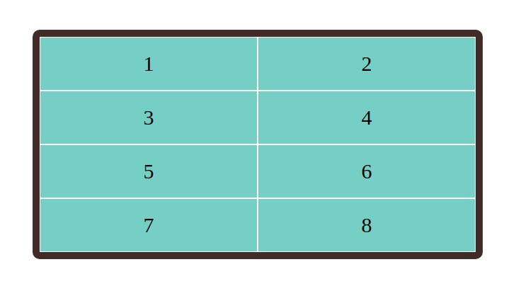
Example for display: grid;. This property make a block-level grid container.
HTML
<div class="container">
    <div class="item">1</div>
    <div class="item">2</div>
    <div class="item">3</div>
    <div class="item">4</div>
    <div class="item">5</div>
    <div class="item">6</div>
    <div class="item">7</div>
    <div class="item">8</div>
</div>
CSS
.container {
  display: grid;
  grid-template-columns: auto auto;
  background-color: #3e2723;
  padding: 10px;
  border-radius: 10px;
}
.item {
  background-color: #80cbc4;
  border: 1px solid #fff;
  padding: 20px;
  font-size: 30px;
  text-align: center;
}
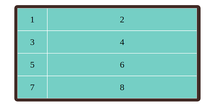
We can change our column dimensions, for example, our first column will be 100px and second column 500px.
CSS
.container {
  display: grid;
  grid-template-columns: 100px 500px;
}
You can play with column and display property, demo link here
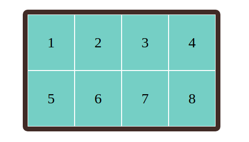
Example for display: inline-grid;. This property make a inline grid container. Demo link here
CSS
.container {
  display: inline-grid;
  grid-template-columns: auto auto auto auto;

  background-color: #3e2723;
  padding: 10px;
  border-radius: 10px;
}
.item {
  background-color: #80cbc4;
  border: 1px solid #fff;
  padding: 40px;
  font-size: 30px;
  text-align: center;
}
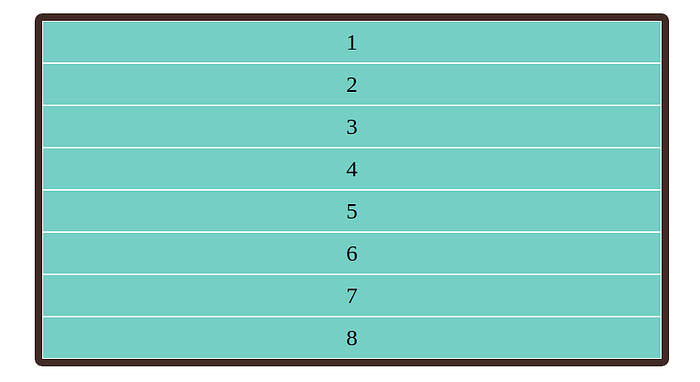
Same things we can do with rows, It’s a very simple. I show few examples below.
CSS
.container {
  display: grid;
  grid-template-rows: auto;

}
Now we will look at Grid Gaps.
The space between each column/row are called gaps.
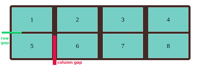
So, for example, we will take the same layout and just change few of CSS properties.
CSS
.container {
  display: grid;
  grid-template-columns: auto auto auto auto;

  grid-column-gap: 10px;
  grid-row-gap: 25px;

  background-color: #3e2723;
  padding: 10px;
  border-radius: 10px;
}
.item {
  background-color: #80cbc4;
  border: 1px solid #fff;
  padding: 40px;
  font-size: 30px;
  text-align: center;
}
or we can write shorthand property like this, it will be the same.
grid-gap: 25px 10px;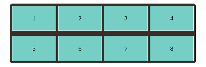
Of course you can play with this properties here
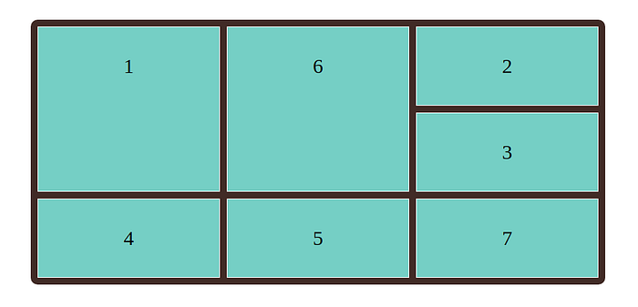
Grid lines (The line between columns are called column lines, the line between rows are called row lines.)
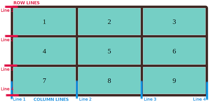
For example we place our item1 and item6 at column line 1, and let it end on column line 3.
HTML
<div class="container">
    <div class="item1">1</div>
    <div class="item2">2</div>
    <div class="item3">3</div>
    <div class="item4">4</div>
    <div class="item5">5</div>
    <div class="item6">6</div>
    <div class="item7">7</div>
</div>
CSS
.container {
  display: grid;
  grid-template-columns: auto auto auto;
  grid-gap: 10px;

  background-color: #3e2723;
  padding: 10px;
  border-radius: 10px;
}
.container > div {
  background-color: #80cbc4;
  border: 1px solid #fff;
  padding: 40px;
  font-size: 30px;
  text-align: center;
}
.item1, .item6 {
  grid-column-start: 1;
  grid-column-end: 3;
}
Of course our syntax can be more shorter, you can do the same with a grid-column property.
.item1, .item6 {
   grid-column: 1 / 3;
}
Demo link here
Let’s take a look at grid-row property.
CSS
.item1, .item6 {
   grid-row: 1 / 3;
}
Demo link here
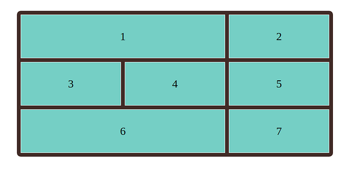
Grid-area property
The grid-area property can be used as a shorthand property for the grid-row-start/ grid-column-start/ grid-row-end and the grid-column-end properties.
HTML
<div class="container">
    <div class="item1">1</div>
    <div class="item2">2</div>
    <div class="item3">3</div>
    <div class="item4">4</div>
    <div class="item5">5</div>
    <div class="item6">6</div>
    <div class="item7">7</div>
    <div class="item8">8</div>
    <div class="item9">9</div>
    <div class="item10">10</div>
    <div class="item11">11</div>
</div>
CSS
.item5 {
  grid-area: 1 / 2 / 5 / 7;
}
item5 will start on row-line 1 and column-line 2, and end on row-line 5 column-line 7.
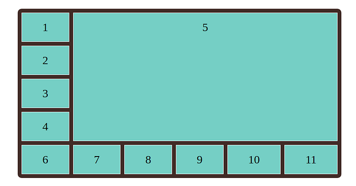
Demo link here
Naming of Grid items
We can assign names to grid items with grid-area property.
HTML
<div class="container">
  <div class="item1">Header</div>
  <div class="item2">Left Side</div>
  <div class="item3">Main</div>
  <div class="item4">Right side</div>
  <div class="item5">Footer</div>
</div>
CSS
.container {
  display: grid;
  grid-template-areas:
    'header header header header header header'
    'menu main main main right right'
    'menu footer footer footer footer footer';
}
.item1 { grid-area: header; }
.item2 { grid-area: menu; }
.item3 { grid-area: main; }
.item4 { grid-area: right; }
.item5 { grid-area: footer; }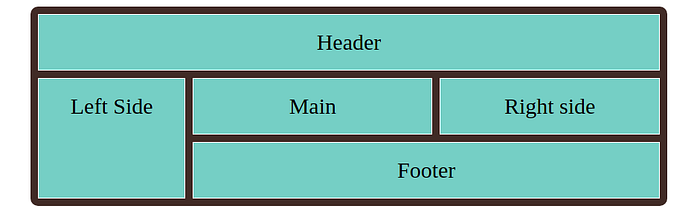
Demo link here
Please follow me on medium and twitter. My twitter account link
Thank you for attention!
I hope you liked this article, and most important if you found it useful.


