Lately, I’ve found a problem. I was looking for fully customizable web components, which would be easy to integrate with and can serve as embedded BI tools for analyzing, reporting and visualization in my application.
I’m using Angular so as a result, it is harder to find the solutions compatible with it. I think I’m not the one who faced such problem so let me share my experience.
Being an Angular user, I’d also like to tell about the best features of Angular. Then I’ll focus on running the analytics in an Angular application and changing the way of creating reports using a JavaScript pivot grid and a charting library.
In addition, we’ll make an easy but powerful report which will be able to help in further analysis. I’m already willing to show you a demo.
TL;DR: go just to the section with useful links that would help you with practice.
Why Angular?
I’d like to begin with telling what is best in Angular in my opinion and how it helps to make the development process quicker and easier.
Building dynamic client-side applications (single or multi-page) with Angular has a lot of advantages:
- Thanks to the modular design of code, the application’s components are easy to manipulate. Therefore, the code is more organized and readable.
- Decoupled components
- Simplified MVC architecture
- A static typing of TypeScript under the hood provides type safety. It and makes the code easier to maintain and refactor.
- Powerful CLI automates the creation of an Angular application.
- Dev community is quite powerful.
These features improve productivity in building the web, desktop, and mobile applications.
Nevertheless, Angular may be quite complicated in learning especially in comparison with React.
Now let’s talk about the solution for web reporting in the project. I’ve used two web components: Flexmonster and Google Charts. Below are more details about each of them.
What is Flexmonster

Flexmonster is a pivot table component written in JavaScript. It’s good for web reporting and analysis. The tool has Angular wrapper which was important for my case.
After adding Flexmonster, you can use all the built-in features to start configuring your own interactive report. It the end, the report can be exported to Excel, PDF, Image, and HTML.
Next, let’s look through the list of analytical features which came in handy for my reporting purposes.
Analytical features
- Aggregation functions (e.g. 16 built-in functions and the ability to create custom ones)
- Sorting, grouping and filtering features
- The drag-and-drop feature
- Slicing & dicing.
How to integrate a pivot table with Angular
As for me, the whole process is as simple as copy-paste. Here’s a tutorial which can help to get started.
Dashboards & data visualization
If you need not only aggregate the data but also visualize it, a dashboard seems to be a good choice. Many analysts like dashboards as they help in tracking business metrics and making data-driven decisions. And, as a developer, you may know that you need a lot of effort to configure it for user requests.
Let’s look through the second tool that will save you time and bring some more data visualization.
What is Google Charts

Google Charts seems the best charting web service in a segment of free software.
You don’t need to manipulate DOM elements with D3.js: use API from Google Charts for such cases. To enliven your data you just need to include the Google Loader into your app, add a DataTable JavaScript object, then pass the data to it and define a chart-drawing function.
How to load data in charts
To get charts data you may use a web service called Datasource or Flexmonster Pivot Table. The former supports the Chart Tools Datasource protocol and allows you to send an SQL query to a Datasource for retrieving a DataTable instance filled with data. The latter can be used as a client-side provider of aggregated data from different data sources. This component offers JavaScript connectors that eliminate the need to write a code of data processing for some basic chart types. But, of course, if you need to implement some custom logic you can do it.
Google Charts in Angular app
Google Charts is also compatible with Angular — I’ve found a wrapper for it on npm.
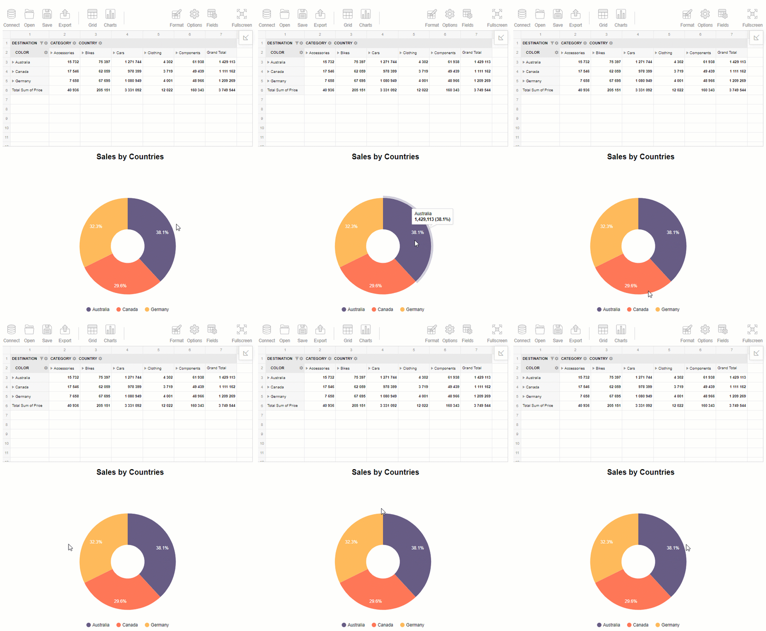
Here is my dashboard where Flexmonster and Google Charts are combined together:

You can see that the charts and tables shine together when being combined. A dashboard can enhance the communication of the analysis results.
Summary
I’ve tried to analyze the advantages of Angular as a platform for building dynamic web applications. But it is not a secret that the learning curve for Angular depends on the project type. Think carefully about whether your particular project needs this framework or not.
Looking forward to hearing your feedback and suggestions.
Useful links
These guides can help you to walk through the process of integration with Flexmonster and Google Charts.
Here is the source code: CodeSandBox Project.
(I recommend to open a web page with a dashboard in a new tab/window as the embedded browser in this IDE doesn’t always show the results correctly)

