Data Visualization in React Application

React is one of the trendiest frameworks for building single-page UI-first applications. Its popularity is increasing for the second year in a row and there are reasons for that.
Getting started with React is easy both for beginners and experienced developers thankfully to the supportive community and detailed documentation — it covers pretty much every aspect of working with React — from basics to advanced concepts. To start developing a web application with a high-performance presentation layer, you only need minimal knowledge of HTML and JavaScript.
Features you’ll love about React:
- Fast learning curve.
- A declarative approach to building UIs which makes the code more predictable.
- Component-based architecture. Components are totally reusable, therefore, maintaining your code is an unchallenging task.
- Performance. The rendering with virtual DOM is fast — the diffing algorithm under the hood of React optimizes expensive DOM operations that are required to update the view. Therefore, the elements are cheap to create.
- Effective event handling system that is implemented through event delegation. It’s compatible with the W3C Document object model.
- Ecosystem. You can take advantage of React Developer Tools that can be installed as Chrome extensions.
- API stability. If something is changed, migration paths are clear.
- A custom rendered called React Native that enables writing native apps for iOS and Android.
- Community. It’s backed by Facebook and a strong community of developers from all around the world. Also, you can find plenty of tutorials, guides and StackOverflow discussions.
- Great for apps with real-time data.
Motivation
As I am a huge fan of both React and data visualization, I’ve decided to share with you my experience of adding a custom dashboard to the React app. Analysts acknowledge a dashboard as the handiest tool for communicating data because it helps them to speed up the decision-making process.
If you are about to develop an application and enhance it with analytical features, you should definitely take a look at these two JS libraries I’m going to build a dashboard with.
The first one is a pivot table — it transforms the raw data into an aggregated one, the second — charting library for insightful and interactive visualization. Together they make up a great responsive and customizable dashboard that fits any project.
Choosing Pivot Table
If you were looking for data analysis and visualization tools for React, you know how tricky the entire process is. From my experience, the choice depends mostly on the project requirements. In particular, when considering a pivot table component for web reporting, the main aspects to which you should pay attention are the following ones:
- Smooth integration with the existing infrastructure.
- Easy connecting to the data sources and switching between them.
- Reporting functionality: aggregation functions, multiple filtering options (date filtering is of special importance), sorting, and grouping.
- Rapid performance. It should leverage both data loading speed and grid rendering.
- Configurable appearance: changing styles and multiple layouts.
- Interactivity.
- Conditional and number formatting. It’s an essential feature as it makes perception of the information easier and helps to focus on the most important data.
- Extensive API.
- Compatibility with all modern browsers and mobile devices.
- Built-in exporting to various formats.
My choice fell on the web pivot table component that has all implemented features inside.

Flexmonster is a JavaScript pivot table control. It’s designed for analysis of data that comes from different data sources: databases, Elasticsearch, simple JSON/CSV files, and OLAP cubes. Also, it has the pivot charts that allow visualizing the aggregated data.
The first thing I liked about it was the UI — it’s elegant, well-organized and allows keeping all the necessary functionality at hand. After I dug deeper into the functionality, I’ve revealed that the pivot table component fully corresponds to the requirements of my analytical project.
To my mind, its strongest feature is the ease of connecting to the data sources and handling a large number of records without leading to app’s performance degradation.
Built-in exporting of reports to Excel and PDF adds an extra advantage as end-users often need to share the results of their analysis with teammates. I didn’t need to install any third-party plugins to enable the exporting feature.
Also, I was pleasantly surprised by the ability to add multiple aggregations to the same measure and create custom formulas for calculating the values. These features make this component flexible and customizable upon the needs.
Choosing Charts

From the perspectives of a developer and an end-user, charts need to satisfy these requirements:
- Interactivity. You should be able to enable/disable elements on the chart easily.
- Responsiveness. Charts should run smoothly across all devices.
- Customization options that include configuring of tooltips, legends, titles, axes labels, zooming, themes, and more.
- Fast performance.
- Drill-down charts for visualization of multi-level data.
- Support of events and data binding for keeping multiple charts synchronized.
All these features are well embodied in the following charting library.
FusionCharts is a lightweight JavaScript charting library which offers a collection of responsive charts, graphs, and maps. It comes with a wide range of integration options: you can use this library with the most popular server-side languages and JavaScript frameworks.
I find it convenient that FusionCharts supports React through an open source wrapper component because anyone can contribute to its development.
The first thing I liked the most is its comprehensive documentation that is full of ready-to-use demos. It’s user-friendly and guides through the process of creating the first chart.
With its rich API, I’ve managed to customize the charts the way I needed — chart components can be configured through attributes. Also, interaction with charts is possible via events, therefore, I’ve managed to attach event listeners to some actions with the chart.
Let me show you one of the interactive samples of charts:
Here you can see data binding in action — the charts are completely synchronized.
How to integrate a pivot table and a charting library
To experience the advantages of components simultaneously, you need to integrate them.
Let’s take a closer look at the process of building a responsive dashboard in React application.
To achieve the best results, I’ve read two guides on integrating the components with React application. You can find links to them at the end of the tutorial.
Firstly, I’ve installed a pivot table as an npm package, loaded the data into the component, and configured the report. This React Integration guide helped me a lot. Secondly, I’ve added the charts to the page and passed the data from the table to them. The entire process of getting all things done took up at most half an hour.
But let’s do it in a step-by-step manner.
Setting up Flexmonster
Assuming that you’ve created a React app, install an npm package of Flexmonster, add a <div> container for a pivot table element and render it:
Once you’ve got the component rendered, fetch the raw data from the database and load it into the pivot table for further aggregation.
Connecting to the database requires using a utility called Compressor that should be installed on the server side. Tests have shown that it considerably speeds up transferring of large amounts of data from the database to the browser. This tutorial helped me to establish communication between the component and the PostgreSQL database.
Now it’s time to build a report.
Firstly, set a slice — a part of a report that specifies which hierarchies to put to the rows, columns, and measures. If you are creating a quarterly report, at this step you can filter the data by the last quarter.
Here is a sample of the slice:
Another option is to add filters dynamically via UI as well:

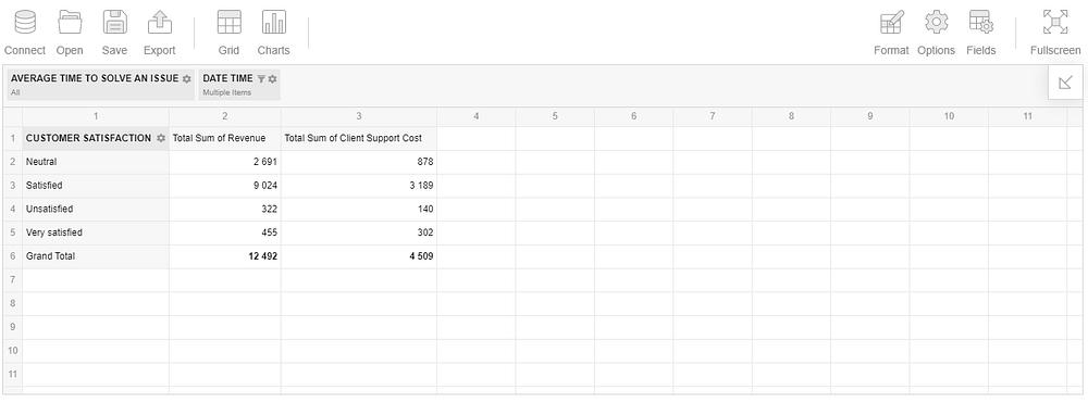
As a result, you can see the rendered pivot table that displays the aggregated data.
Setting up FusionCharts
Follow all the instructions from the Integration with React guide:
- install an npm package and import the component into your app
- create a <div> node where the chart will be displayed
- import themes’ scripts
Don’t forget to add the Flexmonster connector for integration with FusionCharts. It performs data processing for specific types of charts.
Real-time interaction
To create charts once the pivot table is ready to show the data, I’ve attached an event handler to the reportcomplete event of Flexmonster.
To make the two components interact, you need to do the following:
- Define a function which draws and updates the chart.
- Call it when the reportcomplete event is fired.
Flexmonster provides a comfy way to add event listeners:
The next step is to initialize the chart, get the aggregated data from the pivot table and pass it to the chart.
I’ve used flexmonster.fusioncharts.getData() method for this. It handles all the data processing. Firstly, you need to tell the method for which type of chart you want to prepare the data and specify a slice to display on the chart (optionally). After, you need to pass a callbackHandler function that is called once the pivot table is ready to act as a data provider and an updateHandler function that is fired every time some changes occur in the report (filtering, sorting, updating the data). callbackHandler receives the pre-processed JSON data, sets it to the chart and renders the chart instance, updateHandler sets the updated data to the existing chart.
And here you go! Now you can see an interactive dashboard composed of the pivot table and the chart. You can add multiple charts in a similar way. These charts are instantly updated based on the changes in the report. That’s what I call a real-time interaction :)
Try manipulating the report: drag and drop the hierarchies, filter the data and see how your actions are reflected in the charts.
Configuring chart’s appearance
You can tune the appearance of each chart through attributes. I’ve disabled tooltips, added captions and added prefixes for numbers on the chart.
Also, I recommend setting a theme for the chart. There are five of them and all of them are awesome. But my favorite one is a dark theme. Here is how you can apply it:
Styling the pivot table
Another cherry on the top is Flexmonster themes. I’ve decided to harmonize the components and apply a dark theme to the pivot table as well by including its styles:
Summary
With this tutorial, you’ve learned in practice how to create an interactive analytical dashboard based on the data source of your choice. As dashboards are incredibly instrumental in guiding business strategies, the presented solution can serve as a part of an embedded BI in your React app.
To my mind, both Flexmonster and FusionCharts simplify the developer’s life a lot when it comes to featuring your React-powered application with reporting and charting functionality. I encourage you to try using them with your data and create your unique way of expressing the insights.
Thank you for reading!


