How I achieved the Udacity button design
Hey everyone, today I just want to give a quick one on how I achieved one of my favorite buttons design- the Udacity button. What I really like about this button is the transitioning of the shadow, it gives this illusion of the button being slammed down(which kind of excites me!).
Big shout out to the devs at Udacity(I’m a big fan!). So I hope I really do the button justice. You kind find the button on github here. Let’s do this!
Behold! The HTML Mark-up
First I started out with the basics — good ol’ HTML:
Pretty simple right? Just a basic button element with text being wrapped with a div with a class right? Hmm hmm you got it right. But we are not done yet.
And now introducing the CSS
Let’s get to the css part:
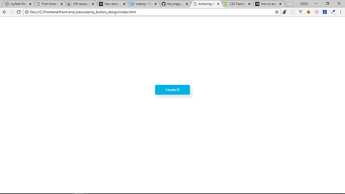
So that’s what the site-wrapper class is for, hmm? So using flexbox, I just centered the button on the viewport(since it’s what we are concerned about, right?). Our button will look like this now:

So our button is all centered and ready to be beautified: The following code does the magic:
Now our button looks like this:
The finishing touch
And the final ingredient to this meal to make it awesome, is what happens when the button is being hovered upon or focused(my favorite):
So our button looks like this when hovered upon:
So that’s it guys, I hope this button inspires you to create more awesome buttons as it has inspired me. Happy coding. Please leave comments below, I love them. The full code is availiable on github

✉️ Subscribe to CodeBurst’s once-weekly Email Blast, 🐦 Follow CodeBurst on Twitter, view 🗺️ The 2018 Web Developer Roadmap, and 🕸️ Learn Full Stack Web Development.

