How to Build a Responsive Bootstrap Website?
If you are new to the web and want to learn how to build a responsive bootstrap website, then you are in the right place. In this tutorial, we will be going through a detailed step-by-step guide on how you make your site responsive using bootstrap.
Bootstrap to the rescue
For those who don’t know about Bootstrap — it is a popular CSS framework that can be used to create the front-end of a website, i.e., design. It is flexible enough to let you build a website with your requirements and can be tweaked accordingly.
As you might know, building a responsive website is a core requirement. Any site that doesn’t tick the responsiveness feature suffers from poor user experience and also rankings as Google doesn’t like websites that are not user-friendly.
No need to be an expert
To build a responsive website, you don’t need to be an expert. The use of Bootstrap makes it possible to easily develop a responsive website as it doesn’t require you to play with specific CSS Grid specifications or Flexbox.
Before we move on the tutorial itself, let’s learn what Responsive Bootstrap Website means.
What is a responsive website?
A responsive website means that the site can be opened on multiple screen sizes that are relevant to all kind of devices that we use daily. The ability to showcase your website to a wide variety of people with diverse devices means improved user experience.
How to Build a Responsive Bootstrap Website?
Awesome! With all the background knowledge equipped, we are now ready to go with the tutorial itself. Let’s begin.
Note: You can use a simple text editor and a browser to get the website ready. However, if you want to explore how it will function as a real website, then we recommend you to check out free VPS such as Amazon Web Services, and get your website online. This way you can check its behavior on different systems or browsers.
Basic Setup
Step 1: Viewport and initial scale
The first step is to set up a responsive Bootstrap properly. It can be done by simply putting the code in your web pages.
<meta name=”viewport” content=”width=device-width, initial-scale=1.0">The above code defines a meta tag that tells the browser to set the width of the website according to the device width. It also set scaling to 1 which equates to default website. In short, we tell the browser that we are going to build a responsive website.
Step 2: Hooking up Bootstrap
Now, it is time to link Bootstrap libraries. It can be done by simply using the code below. To make the code work, you also need to download Bootstrap to your development folder and extract it. It will create two folders within your main development folder as shown in the image below.

Now use the following code and put it in the index.html file below the viewpoint meta tag.
<link rel=”stylesheet” href=”css/bootstrap.css”>
<link rel=”stylesheet” href=”css/bootstrap-responsive.css”>
Starting the Building Process
Depending on what hosting solution you are using, whether it be Amazon S3, a dedicated or shared hosting plan, or even through your own in-house hosting, as long as you are using these same tools and commands, you should be fine in setting this process up. A responsive website can be divided into five major components. As we are building a responsive website, the main components are as follows.
1. Navigation
2. Information area
3. Contents section
4. Right Sidebar
5. Footer.
Step 1: Getting the navigation up
The navigation stays at the top of the website. Apart from that, it can also contain other vital information such as the website name. To ensure that it works, you need to use the “navbar” class as shown in the code below.
<nav class=”navbar fixed-top navbar-expand-md navbar-light bg-light”>As you can see, have also used other classes such as fixed-top, navbar-light, bg-light and so on. These control the text nature, its background and so on.
Now, let’s add more code.
<nav class=”navbar fixed-top navbar-expand-md navbar-light bg-light”>
 <div class=”container”><! — more navigation code here →</div>
</nav>
The above code defines a container div which we can use it to store and manipulate the navigation content.
<nav class=”navbar fixed-top navbar-expand-md navbar-light bg-light”>
 <div class=”container”>
 <a class=”navbar-brand” href=”#”>Responsive Bootstrap Website</a>
 <button class=”navbar-toggler” type=”button” data-toggle=”collapse” data-target=”#navbarCollapse” aria-controls=”navbarCollapse” aria-expanded=”false” aria-label=”Toggle navigation”>
 <span class=”navbar-toggler-icon”></span>
 </button>
 <div class=”collapse navbar-collapse” id=”navbarCollapse”>
 <! — left navigation links →
 <ul class=”navbar-nav mr-auto”><! — active navigation link →
 <li class=”nav-item active”>
 <a class=”nav-link” href=”#”>Home
 <span class=”sr-only”>(current)</span>
 </a>
 </li><! — regular navigation link →
 <li class=”nav-item”>
 <a class=”nav-link” href=”#”>About</a>
 </li><! — more navigation links →<li class=”nav-item”>
 <a class=”nav-link” href=”#”>Blog</a>
 </li></ul><! — right navigation link →
 <ul class=”nav navbar-nav ml-auto”>
 <li class=”nav-item”>
 <a class=”nav-link” href=”#”>Login</a>
 </li>
 <li class=”nav-item”>
 <a class=”nav-link” href=”#”>Register</a>
 </li></ul>
 </div>
 </div>
</nav>
Most of the above code is self-explanatory. We create branding and menu items using predefined classes. We also highlighted the Home menu item so that people know on which page they are currently browsing. Other than that we also used collapse navbar-collapse. It makes menu stack when viewed in smaller screens.
Step 2: Getting the Information area up
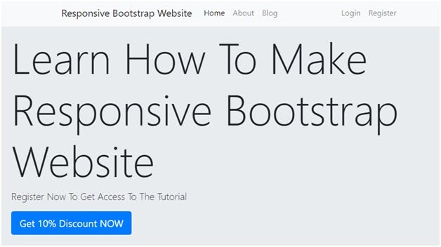
Putting the required information on your website is easy thanks to the jumbotron class. To make sure we keep things organized, we will be using the div tag.
Let’s look at the code below to get a better understanding.
<div class=”jumbotron”>
 <h1 class=”display-2">Learn How To Make Responsive Bootstrap Website</h1>
 <p class=”lead”>Register Now To Get Access To The Tutorial</p>
 <a class=”btn btn-lg btn-primary” href=”#” role=”button”>Get 10% Discount NOW</a>
</div
The other two key classes here is the display-2 and btn btn-primary btn-lg classes. They create big content on the website center.
Step 3: Getting the content ready
It’s now time to create the content section for the responsive website. To ensure that we make this section responsive as well, we are going to use the col-md-8 mb-4, col-md-4 mb-4 and so on. As you can see, we are using the Flexbox-based bootstrap grid system.
The col-md-* is the basis of the whole structure. It is a two-column layout which will be triggered once the website finds a medium sized screen. Similarly, col-xs-* will be triggered if a smaller screen is encountered. The choice of the classes is all upon you as you need to decide which screen sizes to target.
The only thing that you need to keep in mind is that the total column supported by bootstrap is 12. This means that you need to only put the classes that sum up to 12. If not done correctly, the code will not perform as intended. Furthermore, you can also use the row class within the columns and nest them using a div element. Let’s take a look at the code below to get a proper understanding.
<! — nested columns →
<div class=”row”>
 <! — first nested column →
 <div class=”col-md”>
 <h3 class=”display-4">A complete introduction to Bootstrap</h3>
 <p>
 Get to know Boostrap as a child
 </p>
 <a href=”#” class=”btn btn-primary”>Learn More</a>
 </div><! — second nested column →
 <div class=”col-md”>
 <h3 class=”display-4">Learn Web Development The Right Way</h3>
 <p>
 Want to become a full-time web developer?
 </p>
 <a href=”#” class=”btn btn-primary”>Learn More</a>
 </div><! — third nested column →
 <div class=”col-md”>
 <h3 class=”display-4">Check out collection of books</h3>
 <p>
 Get best books, the right way to learn
 </p>
 <a href=”#” class=”btn btn-primary”>Learn More</a>
 </div>
</div>
Step 4: Getting the Right Sidebar Ready
Awesome, we have built a significant part of the website. Now, it is time to get the right sidebar ready. In our website’s case, we will be listing the vertical navigation list on the sidebar. To do it, all you need to do so is use the code below.
<ul class=”nav nav-pills flex-column”>
 <li class=”nav-item”>
 <a class=”nav-link active” href=”#”>Key tutorials</a>
 </li>
 <li class=”nav-item”>
 <a class=”nav-link” href=”#”>Learn from experts</a>
 </li>
 <! — more links →
</ul>
Step 5: Footer
The last step is to get the footer ready. Footer provides business information or any other copyright information. To build the booter, simply use the code below.
<footer class=”container mt-4">
 <div class=”row”>
 <div class=”col”>
 <p class=”text-center”>Design by <a href=”#”>Aliens</a></p>
 </div>
 </div>
</footer>
Conclusion
This leads us to the end of our tutorial. If you are having some spacing issues with elements, we recommend you to put classes that require them to function properly. To check if your website is working properly or not, you can check it by resizing the window. Also, dive deep into Bootstrap as you can do tons of things with it.
So, did you like the tutorial? If you do then do not forget to comment below and let us know. Also, share the tutorial with your peers!
