How to create a super-ellipse CSS button based on Lamé curve
I’ve always been a CSS fiend. Ever since I started creating web content I have been looking for the “perfect” button. The one button that users want to click over and over again.
We’ve seen the rise of flat, material, skeuomorphism and atomic design over the years, but I haven’t seen any CSS frameworks make use of the Lamé curve on buttons yet.
So today, I’m going to teach you how to create your very own super-ellipse CSS button. Let’s get started!
We first create a regular HTML button with the following class:
<button class=”button”>This is a button</button>This is the result to far:

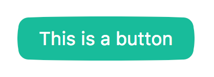
We then add the usual CSS to create something more attractive:
.button {
    background-color: #1abc9c;
    border: 0;
    outline: none;
    padding: 10px 20px;
    color: #ffffff;
    position: relative;
}
Here’s the result:

Now, here comes the tricky part; we’re gonna use ::before and ::after to create our the superellipse border-radius of our button. The idea is to create extra content behind our button to achieive the illusion of a superellipse:

The red sections are the ::before and ::after selectors. All we need now is to find a rule that will adapt them to the width and height of our original button. So let’s start by adding a 10px border-radius to our button and add the following code to our ::before element:
.button::before {
    border-radius: 5% / 50%;
    background-color: red;
    top: 2px;
    bottom: 2px;
    right: -2px;
    left: -2px;
}
Here is the result (zoomed in):

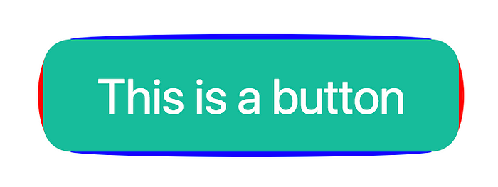
Now, we do the same thing for the top and bottom of our button:
.button::after {
    border-radius: 50% / 5%;
    background-color: blue;
    top: -2px;
    bottom: -2px;
    right: 10px;
    left: 10px;
}
Result (zoomed in):
And here is the final result with some more CSS and tweaks:
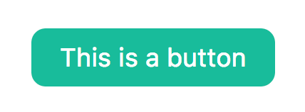
Which one looks better? Is it worth the hassle? Any other ideas how to do it? Let me know in the comments!

