How to make a collapsible menu using only CSS

Being a new developer, it’s hard not to look at all the sites on the web and think “Damn, I’d really like to build something like that…”, then after looking into what it would take, come to the realization that you’ve still got a lot to learn.
You’ve probably wondered what can be accomplished when you know the fundamentals of HTML & CSS, but don’t know enough of that good stuff that makes the web look as cool as it does. (I’m looking at your JavaScript 👀) It can be frustrating at times, but it also pushes you to look for less obvious solutions to your problems.
There are some amazing things you can accomplish using only CSS, and in this post I’m going to share an example of a pretty simple solution for a collapsible navigation menu that I found.
The Setup
We’ll start by making a navigation menu using a list<ul> and list items <li>.
<div class="collapsible-menu">
<div class="menu-content">
<ul>
<li><a href="#"></a>Home</li>
<li><a href="#"></a>Services</li>
<li><a href="#"></a>Projects</li>
<li><a href="#"></a>About</li>
<li><a href="#"></a>Blog</li>
<li><a href="#"></a>Contacts</li>
</ul>
</div>
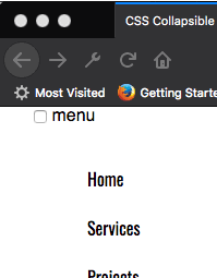
</div>Next, we’ll add a checkbox with a label of Menu above the div that holds the menu content. We’ll style this later to trigger the opening and closing of the menu.
<body>
        <div class="collapsible-menu">
            <input type="checkbox" id="menu">
            <label for="menu">Menu</label>
            <div class="menu-content">
                <ul>
                    <li><a href="#"></a>Home</li>
                    <li><a href="#"></a>Services</li>
                    <li><a href="#"></a>Projects</li>
                    <li><a href="#"></a>About</li>
                    <li><a href="#"></a>Blog</li>
                    <li><a href="#"></a>Contacts</li>
                </ul>
            </div>
        </div>
    </body>
Here’s what the menu looks like without any styling.

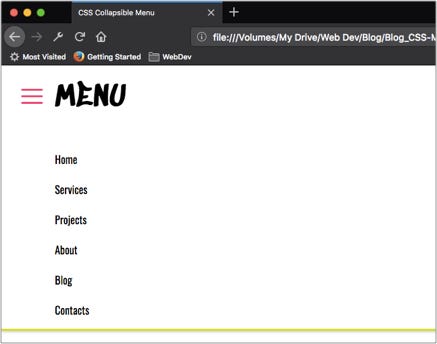
Let’s add some padding, borders and style our list to look more like a menu.
.menu-content {
    font-family: 'Oswald', sans-serif;
    padding: 0 0 0 50px;
}.collapsible-menu {
    background-color: rgb(255, 255, 255);
    padding: 0px 30px;
    border-bottom: 3px solid #CDE700;
    box-shadow: 1px 2px 3px rgba(0,0,0,0.2);
}.collapsible-menu ul {
    list-style-type: none;
    padding: 0;
}.collapsible-menu a {
    display:block;
    padding: 10px;
    text-decoration: none;
}

What’s up with the checkbox?
The checkbox is a pretty easy way to toggle back and forth between two states.
Even if we hide just the the checkbox so it’s not visible on the page, we’re still changing it’s state to checked when we click ‘menu’. What we want to do is show the menu content when the checkbox is selected and hide the menu content when it is not.
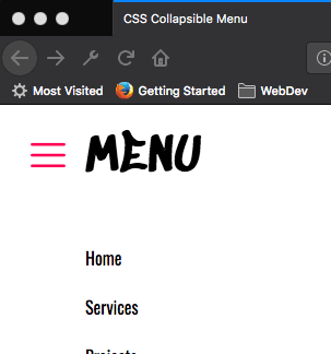
We’ll style the label for the checkbox by adding a background image for the hamburger menu. We also want to make the label look like it’s a link even though it’s not, so we’ll use cursor:pointer. Lastly, we’ll hide the checkbox using display:none.
.collapsible-menu label {
    font-family: 'Sedgwick Ave Display', cursive;
    font-size: 56px;
    display: block;
    cursor: pointer;
    background: url(menu.png) no-repeat left center;
    padding: 10px 0 10px 50px;
}input#menu {
    display: none;
}
We end up with something like this:
Note: I downloaded the icons I used from Flat Icon. Go check them out, they have a huge selection of icons to choose from!
We can change the background image from ‘menu’ to ‘close’ by using the following code:
input:checked +label {
    background-image: url(close.png);
}
Collapse & Expand
We’re almost done! Now we just have to set the default state of the menu to be collapsed when when checkbox is not checked. We do this by changing the max-height of .menu-content to 0, but have it display a max-height of 100% when the checkbox is checked.
.menu-content {
    max-height: 0;
    overflow: hidden;
    font-family: 'Oswald', sans-serif;
    padding: 0 0 0 50px;
}/* Toggle Effect */input:checked ~ label {
    background-image: url(close.png);
}input:checked ~ .menu-content {
    max-height: 100%;
}/*Icons made by https://www.flaticon.com/authors/cole-bemis from www.flaticon.com/ */
That’s it! It’s a really quick and easy way to add a collapsible nav without any JavaScript.
I love discovering different approaches to solve a problem. It’s fun to see things from a different angle. What other CSS tricks have you tried?
Tip: Watch The Net Ninja’s YouTube video where he goes through the process in detail.
