
How many of us know there are various types of UI programming style?
Hmm… Great question. However, most of us don’t have any idea regarding this.
Let’s try to know now…. There is Imperative UI and Declarative UI programming style.
Let’s try to understand them rather than jumping to the SwiftUI.
What is imperative UI?
The imperative UI programming is most familiar with all of us — where we construct a full-functioned UI entity, such as a View, Image, Button or equivalent, and later update it using methods and setters when the UI changes.

The flip side is, you carry the burden of handling the events, a transition of UI, maintaining the states, etc.
As a developer, we can offload some burden by using ReactiveCocoa. However, dependencies on a 3rd party is a big NO for me.
What is declarative UI?
It is a style of building the structure (UI), element (controls), component (text, font) that will be used in the views by just plug-in another view.
Couple of high level advantages with Declarative UI
🎯 Saying what you want
🎯 Shorter, simpler code
🎯 Adapts to change like size, position
🎯 Reusable

Flutter is the best example of declarative UI.
Why are we discussing those UI programming styles?
A few days ago at WWDC’19, Apple introduces us to an innovative new way to build user interfaces across all Apple platforms lets you create better apps with less code with SwiftUI.
The SwiftUI is a fully native declarative UI framework.
Let’s understand what it has for a developer,
🎯 It uses a declarative syntax.
🎯 It knows when that state changes and updates view rendering
🎯 Build reusable components
🎯 Reduce the amount of code needed to design a screen, delegates, and use actions
🎯 Auto update the UI components on model parameter change automatically
🎯 Default supports the Dynamic type and Dark mode :)
Working with declarative programming is a paradigm shift. In first try it is difficult to digest. However over time you will fall in love with it.
In SwiftUI, you are only going to talk about views, Why?
Views are the visual building blocks of your app’s user interface. Use them to present your app’s content onscreen. Views represent text, images, shapes, custom drawings, and compositions of any and all of these together.
Every component in SwiftUI is a view and will conform to the View protocol.
You can combine views using containers (V/H/Z Stack) that specify their visual relationships and hierarchy.
You can use modifiers like .font(.title) or .backgroundColor(.red) to customize the display, behavior, and interactivity of built-in views and those you create for your app.
High level components to know from SwiftUI
🏷️ UIHostingController
It is a UIViewController which takes a content of type View. This controller will be hosting our view in it. We can set our UIHostingController as a rootviewcontroller of the window.
🏷️ View
This is a View protocol. A View protocol has a property called body which is also a View.
Implement the required body computed property to provide the content and behavior for the custom view.
🏷️ PreviewProvider
It’s a protocol which help us to implement a computed property called previews to see the live view in Xcode. You can define any number of previews as wanted for devices or platforms.
🏷️ HStack
It’s a container which contains a content/elements/children's and arranges its children in a horizontal line.
It can align children to .bottom, .center, and .top to itself
🏷️ VStack
It’s a container which contains a content/elements/children’s and arranges its children in a vertical line.
It can align children to .leading, .trailing, and .center to itself
Horizontal and Vertical stack view has their own restrictions in terms of child element alignment. Thats why they have came up with a ZStack. (Not Z axis)
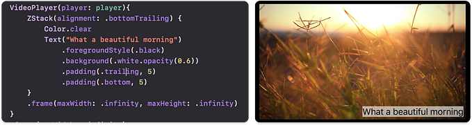
🏷️ ZStack
It’s a container which allows to overlay a view and allow its children to be align in both axes.
It has .bottom, .bottomLeading, .bottomTrailing, .center, .leading, .trailing, .top, .topLeading, and .topTrailing
🏷️ Spacer
A flexible space that expands along the major axis of its containing stack layout, or on both axes if not contained in a stack.
🏷️ Divider
A visual element that can be used to separate other content.
🏷️ Padding
Pads this view using the edge insets you specify.
🏷️ Text
A view that displays one or more lines of read-only text.
🏷️ Image
A view that displays an environment-dependent image.
🏷️ List
A container that presents rows of data arranged in a single column.
🏷️ Form
A form based containter that presents rows.. extension to list :)
Xcode has a template for the called ‘SwiftUI View’ in the User Interface categories.
🏷️ Binding
@State It helps to persist and monitor the state. Any members/variables/properties marked with annotation @State holds the state.
@Bind, @EnviormentalObject BindableObject and many more…..
What next?
Combine is another framework which will be used to handle asynchronous events and processing values over time which can be provide to the SwiftUI.
NOTE:
SwiftUI is a framework that means it will only work with iOS 13 and onwards. That means you might need to wait for 1–2 years to have production ready application with SwiftUI.
This is just a beginning; I will be covering every SwiftUI component in detail in the upcoming articles.
Part 1- Playing with Text, Button and Image in SwiftUI


