Make a Magic: The Gathering card in CSS
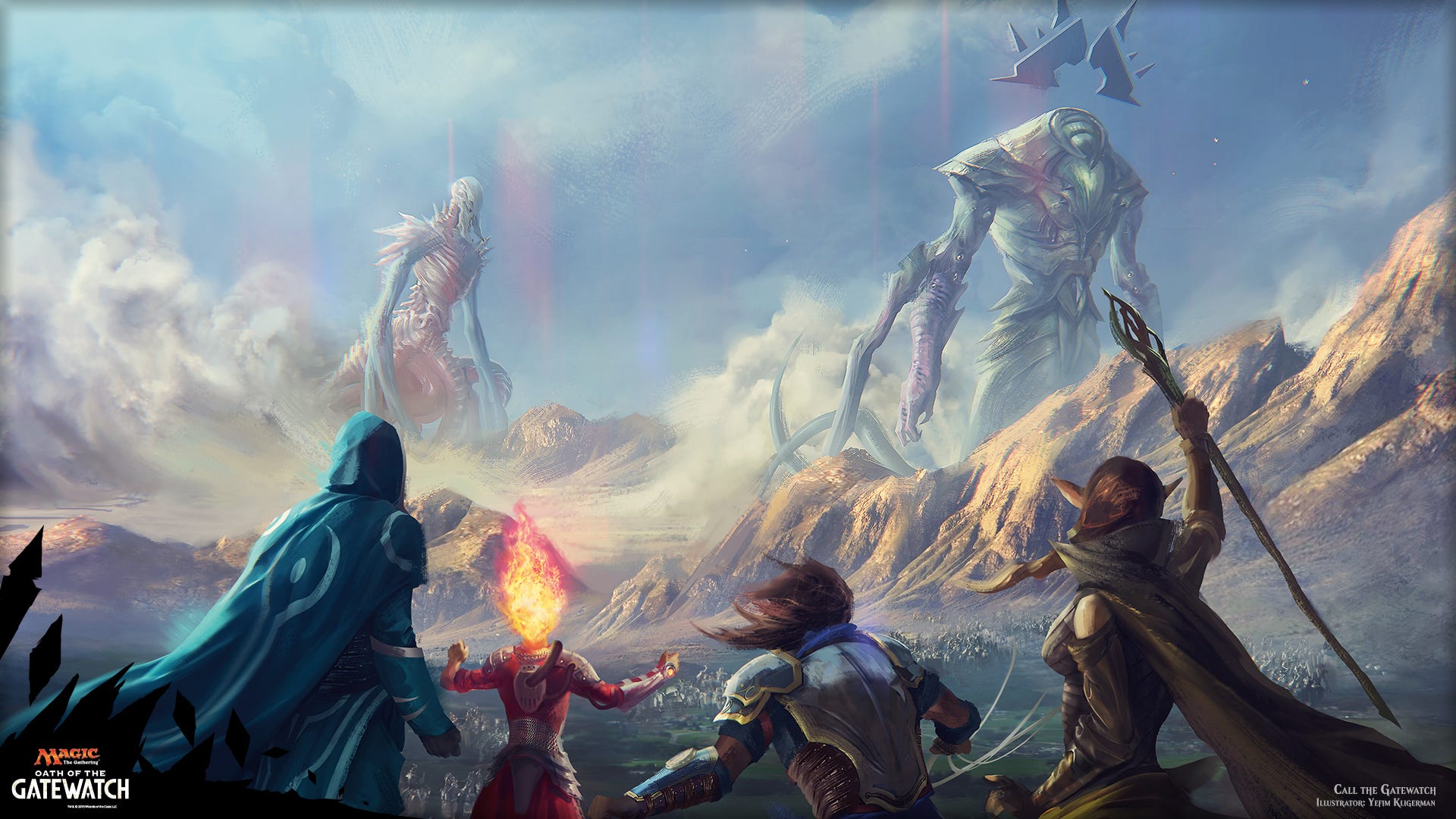
For those few people who lived in a cave up until now — or haven’t nerded with cards in his/her life — Magic: The Gathering — or MTG, in short — is an amazing trading card game.
The best thing about it is that it’s like chess and the fantasy genre met one day and hooked up. From this intercourse Magic was born. This is also the reason why it’s played by people of all ages: you can dive in this fantastic world and play the role of a planeswalker: a being with mystic powers — of darkness, light, forest, water, fire — to your own advantage in order to win the battle.
Cards come in expansions, each has its own story and they are connected with one another in this sense.
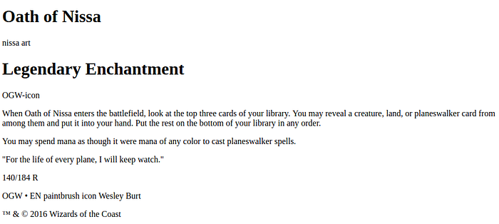
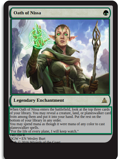
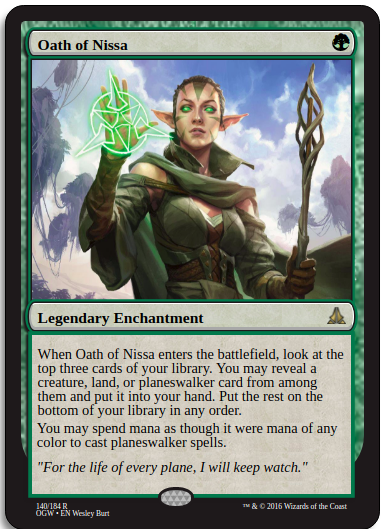
One of my favorite cards is the mighty Oath of Nissa due to the expansion it comes in — Oath of the Gatewatch — the story behind it and its graphic.
I had the idea to replicate it in CSS as fun practice experience. Since I found it very useful for learning, I wrote this article to guide you throughout the same process I experienced.
It’s filled up with all the code I wrote, step by step.
To boost your learning, I recommend typing the code along in CodePen as you read.
Let’s get started.
Divide and Conquer
It seems overwhelming to replicate such piece of art in CSS. I know this feeling because I experienced it myself when I wanted to do such a thing.
But hear me out: if there’s one single lesson I learned while coding a website or programming is this: no matter how gigantic it may feel, it’s totally possible. The only thing to do is to divide and conquer.
Divide that huge problem into parts. Then divide each part in sub-parts. Then divide each sub-part into further sub-parts and so on, until you get a single task simple enough that you can take it on your own. Now that you look at how the dismantled problem, it is not so scary anymore, right? Almost like we unmasked Oz, ha?
When I approached this problem, the first thing I did was to examine the card from a CSS point of view. I focused on one thing: figure out what could be its structure in terms of boxes. So let’s try to look at it now and do the same thing.
Destructuring
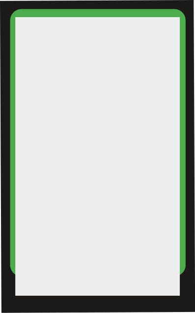
So, the first obvious thing I notice is the black area on the back that wraps the entire card. In fact, as you can see all the card’s components (image, title, text, arts) is contained inside this black area. Then it’s fair to say that we can consider this the container of the card itself, much like we would use a container div to pack an entire page content. So here it is our first box.
The second major area I notice is the green background that comes right after the what-we-call-now container. You may doubt it but I can assure you it’s a background for the rest of the card content. In fact, if you pay close attention you may notice that there’s a third major area that lies on it.
The third area is in fact the one that looks like is laying on the green background. There’s one detail about it that catches my attention: it’s longer than background while it covers it. This may seem something difficult to do, but trust me it is easy to realize. There’s one CSS property that addresses this problem more than we could ask for: the z-index. In fact, we can just give this third area a higher z-index than the background and solve the issue.
To recap, there are three major area we noticed:
1. Black container
2. Green background
3. gGray area containing the card’s data
Here’s a simple scheme illustrating this:
I did a quick research on the structure behind a Magic card. Here you can see the details.
The third area — the one containing all the important data — on the other hand, is named frame. With relevance to our case, a card frame contains, in order:
1. Title area involving:
- name
- casting cost (the forest symbol on the far top right)
2. Illustration (or Art)
3. Type Line area, which displays the following:
- card type (obviously, which is Legendary Enchantment for us)
- expansion symbol (the golden triangle-like one on the right)
4. Text box
5. Power/toughness (not available for enchantment, so our card lacks it)
6. Information below the text box, organized as follows:
- left collector’s number — 140/184, rarity (R), set (OGW — Oath of the Gatewatch), card’s language (EN — English), credits for the author of the illustration (props to them really, one of the best things about Magic are the illustrations indeed)
- middle: there’s a Holofoil stamp since the card we want to replicate is rare (notice the gold-colored symbol on the Type Line)
- right: copyright information
Here’s the same scheme illustrating the card, but this time I added the new-found names on it
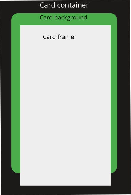
So not only we have a clear vision of how we should organize the card structure, now we also have excellent name suggestions for the various divs we are going to create.
I say we have all the necessary information to build the HTML of the card. We have to translate our structure into HTML.
HTML
Again, when you see a snippet of code don’t get overwhelmed: as everything in code and programming, we can always divide a huge problem into smaller, simpler tasks. This goes for HTML too.
Let’s give a look at this code.
As you can see it reflects what we came up to in the previous section. There are three main divs:
<div class=”card-container”><div class=”card-background”><div class=”card-frame”>

        </div>

    </div></div>
The card-frame div is the one we must focus our attention to for the moment, as it contains the main information.
Frame header
<div class=”frame-header”>
 <h1 class=”name”>Oath of Nissa</h1>
 <! — here goes the mana icon →
</div>
Frame art ( illustration)
<! — Here goes the illustration — >Frame Type Line
<div class=”frame-type-line”>
 <h1 class=”type”>Legendary Enchantment</h1>
 <! — Here goes the set icon →
</div>
Frame text box
<div class=”frame-text-box”><p class=”description ftb-inner-margin”>When Oath of Nissa enters the battlefield, look at the top three cards of your library. You may reveal a creature, land, or planeswalker card from among them and put it into your hand. Put the rest on the bottom of your library in any order. </p><p class=”description”> You may spend mana as though it were mana of any color to cast planeswalker spells.</p><p class=”flavour-text”>”For the life of every plane, I will keep watch.”</p></div>
Frame bottom
<div class=”frame-bottom-info inner-margin”>
<div class=”fbi-left”>
<p>140/184 R</p>
<p>OGW • EN <! — paintbrush symbol → Wesley Burt</p>
</div><div class=”fbi-center”></div><div class=”fbi-right”>
™ & © 2016 Wizards of the Coast
</div>
</div>
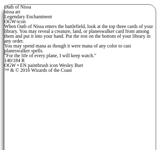
Here’s what the HTML for the card looks like:
It is ok, but there’s still one thing we need to get rid of: the browser’s default styling. The reason behind it is pretty simple. You see, each browser default styling is slightly different from one another. So, in order to avoid inconsistencies, we are going to remove those defaults and reset everything to 0. Once we do that we can restart to make our own style from scratch.
There’s a pretty popular online tool for this, the Meyerweb reset (which you can find here. For the sake of keeping this post short, I’m not going to paste it here. You just go to the mentioned link, copy the CSS code and then paste it in your CSS file.
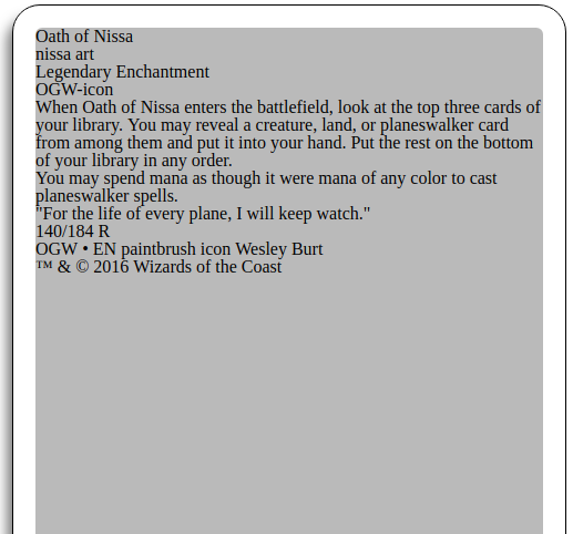
Here’s how the HTML look like after the reset:
Ugly, huh? Well, not for so long!
The time to add styling, the main and best part for this project, has come.
Card container
As a first, let’s handle the card container.
We need to give it some width and height.
We need to center it in the page so that our work will look more polished in general.
Some margin to give some distance and space from the top of the page.
Some border radius to reflect what the original card’s borders are.
Some shadow and a temporary black border, so that we know what we are doing.
Here’s the code:
.card-container {
border: 1px solid black;
width: 500px;
height: 700px;
margin: 0 auto;
margin-top: 56px;
border-radius: 25px;
box-sizing: border-box;
box-shadow: -8px 9px 16px -3px gray;
/*background: #171314; */
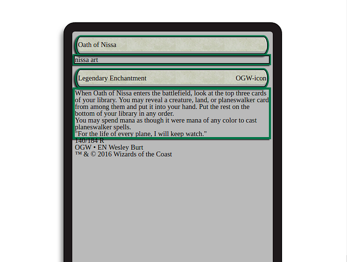
}This is what we get:
It’s a little improvement, but not enough.
Let’s keep going.
Card background
As a start, let’s code an initial background so that we can start to see something more similar to a card.
Let’s give it a height, but be careful to give it one that is lower that the container’s. I chose 600px.
Let’s also put some margin. Here make sure to set it on all sides except the bottom, because that gap will be covered by the frame. I chose a 20px to the left, top and right.
Let’s give some roundness to the border, as to reflect the card. Here I compared the original card with my work and played with pixels until I got a result I was satisfied by.
At last, let’s give it some background color, just to make clear the distinction between container and background.
.card-background {
 height: 600px;
 margin: 20px 20px 0 20px;
 border-top-left-radius: 6px;
 border-top-right-radius: 6px;
 border-bottom-left-radius: 8%;
 border-bottom-right-radius: 8%;
 background-color: #bbb;
}
Here’s the CodePen to check the card and the code we wrote until now.
Now let’s add some color to the border. I used a color picker to get the card’s border actual color — #171314
So it would be
.card-containr {
 background: #171314;
}
Card Frame
Let’s handle the card frame now — the big deal in this project.
As a first, we give it some initial, general style
.card-frame {
 z-index: 1;
 position: relative;
 height: 108%;
 max-width: 97%;
 left: 1%;
 top: 0.5%;
 left: 1.2%;
 display: flex;
 flex-direction: column;
}
We use z-index to literally place the frame on the background and give the former a greater height than the latter. And we position it a bit on the left too. This way it’s possible to replicate what is in the original card.
To make the z-index work, let’s fix the .card-backgroundby giving it a z-index
.card-background {
 z-index: 0;
}
Multiple color Borders
Let’s add a section dedicated to the frame borders, just before the style we just added.
/*
 — — — — — — — — — — — — -
 — — — — — — — — — — — — -
 BORDERS
 — — — — — — — — — — — — -
 — — — — — — — — — — — — -
*/
.frame-header,
.frame-type-line {
 border-bottom: 4px solid #a9a9a9;
 border-left: 2px solid #a9a9a9;
 border-top: 1px solid #fff;
 border-right: 1px solid #fff;
}.frame-header,
.frame-art,
.frame-type-line {
 box-shadow:
 0 0 0 2px #171314,
 0 0 0 5px #26714A,
 -3px 3px 2px 5px #171314;margin-bottom: 7px;
}.frame-text-box {
 box-shadow:
 0 0 0 5px #26714A,
 -3px 3px 2px 5px #171314;
}
Here’s what it does.
The initial styling gives .frame-header and .frame-type-line inner border colors.
But they are not the main decoration.
In fact, to replicate external borders colors I discovered a little hack: I used multiple box shadow with 0 offset on both axes, no blur nor spread radius. There are only flat, colored shadows — that looks just as but are not borders.
Now, just to be sure not to make any damage with all the upcoming style, we avoid showing any overflow
/*
 — — — — — — — — — — —
 — — — — — — — — — — —
 OVERFLOW
 — — — — — — — — — — —
 — — — — — — — — — — —
*/
.frame-header,
.frame-type-line,
.frame-text-box {
 overflow: hidden;
}
Frame header and type line
At this point let’s go back to the frame section and continue to style.
For these two areas, I wanted to replicate their unique grayish background, so I searched for similar texture and I found this:
Then we add it with this code
.frame-header,
.frame-type-line {
background:
linear-gradient( 0deg, rgba(201, 216, 201, .3), rgba(201, 216, 209, .3) ),
url(https://image.ibb.co/jKByZn/tile_bg_1.jpg);
display: flex;
margin-top: 10px;
margin-left: 5px;
margin-right: 5px;
padding: 8px 0;
display: flex;
justify-content: space-between;
border-radius: 18px/40px;
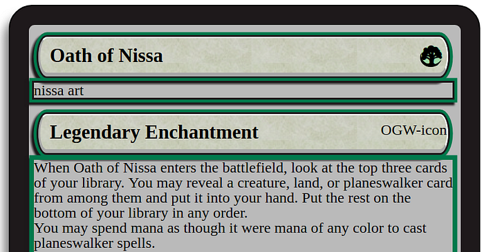
}Check out what we have now!
A little better, right? Now we can dive in the frame specific parts.
Name and type
Name — Oath of Nissa — and type — Legendary Enchantment — should be more readable. I increased their size, put them a little more on the right and made them bolder.
.name,
.type {
 font-size: 1.3em;
 margin-left: 10px;
 align-self: baseline;
 font-weight: 600;
}
Mana Icon
You are gonna like this. There’s this guy — Andrew Gioia — who created Magic: The Gathering symbols that can be used as if you were adding a Font Awesome icon.
That’s crazy and I’m grateful for what he did immensely.
Thanks to his work we can add the mana icon on the title area’s right corner and it’s simple too. You just need the CDN of the mana set. You can find it here — or just copy it from below.
<link href=”//cdn.jsdelivr.net/npm/mana-font@latest/css/mana.css” rel=”stylesheet” type=”text/css” />Add this to the `head` of your HTML file. Since I’m using CodePen for this walkthrough, I opened “Settings”, then went to “Stuff for <head>” and pasted the code.
Right now the mana icon is just a tree, we need to give it a bit of styling to make it look exactly like we wanted.
#mana-icon {
 font-size: 1.4em;
 background: #ADD3AC;
 border-radius: 50%;
 box-sizing: border-box;
 box-shadow: -0.05em 0.12em 0px 0 black;
 margin-right: 5px;
 height: 20px;
 align-self: center;
}
Frame Art
For this one I simply looked online and found the image that looked more authentic. I uploaded it in order to add it on CodePen, here’s the link https://image.ibb.co/fqdLEn/nissa.jpg
Insert it into index.html
<img class=”frame-art” src=”https://image.ibb.co/fqdLEn/nissa.jpg" alt=”nissa art”>Then
.frame-art {
 height: 50%; /* make it fit in the card */
 margin: 0 10px; /* align it vertically */
}
Huge improvement from before!
Set icon
From MTG Gamepedia:
A set in Magic: The Gathering is a pool of cards released together and designed for the same play environment.
[…]
An expansion symbol and, more recently, a three-character abbreviation is printed on each card to identify the set it belongs to.
Oath of Nissa is a card that comes in the Oath of the GateWatch expansion, its symbol is what you see right after the type name. Its abbreviation being OGW.
Remember Andrew Gioia?
That fellow made icons for set symbols too (awesome) and it happens that he did the symbol we are interested in too.
There is just one thing: his icon is too gold, hence it doesn’t have that white the original symbol has.
This is why I opted for looking online in the hope I could find an OGW rare symbol I could use. I was lucky.

The gold is what signals the card’s rarity.
So, with this image in our hand, we place it in the HTML and style it as follows.
This is how I put it in the div with class `.frame-type-line`
<img src=”https://image.ibb.co/kzaLjn/OGW_R.png" id=”set-icon” alt=”OGW-icon”>I needed to contain its original dimension: as you can see, right now is out of proportions.

Let’s fix it.
#set-icon {
 height: 9%;
 width: 6%;
 overflow: hidden;
 margin-right: 10px;
 align-self: center;
}
Let’s nullify the `margin-top` of the type line
.frame-type-line {
 margin-top: 0;
}
Text Box
OK. At this point we can style the text box. There is a background here too, much similar to the type line. So I looked online (again) to find the most accurate texture I could.
.frame-text-box {
 margin: 0 10px;
 background: #d3ded6;
 background-image: url(https://image.ibb.co/dFcNx7/tile_bg_2.jpg);
 display: flex;
 flex-direction: column;
 justify-content: space-around;
 padding: 50px 6px;
 box-sizing: border-box;
 font-size: 1.2em;
}
With Flexbox we make sure text fits its container. Then we make some space around it — as we see in the original card — by using some padding on all sides. To finish it’s a good idea to increase the font size.
As for the flavor text, some padding and italics do well for us.
.flavour-text {
 font-style: italic;
 padding: 10px 0;
}
Lastly, some margin to make little room for breathing.
p {
 margin-bottom: 5px;
}.ftb-inner-margin {
 margin: 5px 1px;
}
Check-in.

Frame bottom info
The last part to handle is the frame bottom, that as mentioned earlier can be divided in three sub-parts: left, center and right.
.frame-bottom-info {
 color: white;
 display: flex;
 justify-content: space-between;
 margin: 5px 15px 0 15px;
}
With Flexbox — in particular withjustify-content: space-between — it’s possible to handle the space among these three sub-parts pretty easily.
Then, we make the text of these areas smaller and we position them as per the card.
Left and right
.fbi-left {
 flex: 1;
}
.fbi-left p:first-of-type {
 margin-bottom: 1px;
}.fbi-right {
 flex: 1;
 text-align: right;
}.fbi-left,
.fbi-right {
 font-size: 10px;
 position: relative;
 top: 6px;
}
Center
Here, there’s the last background we can see: a texture inside the middle circle. As before, Google answered the question with this image:

I show you the code
.fbi-center {
 border-radius: 60%;
 flex-basis: 41px;
 height: 21px;
 position: relative;
 bottom: 11px;
 z-index: 2;
 background: lightgray;
 background-image: url(../images/holofoil-texture-2.jpg);
 box-shadow:
 0 0 0 4px #171314;
}
The radius of the border is used to give the image the wanted roundness. Then, I proceed to fix the width and the border color (with the shadow hack we saw before), and position it.
Almost done!!!
Green background
One last thing to do: add the green background. For this one, I used Gimp to cut the actual background out of the original image, then pasted it in a new file with the card size, and repeated the pasted area to cover the entire space.
This is what I got:
To add it to the card:
.card-background {
 background-image: url(../images/green-background.jpg);
 background-repeat: no-repeat;
 background-size: cover;
}
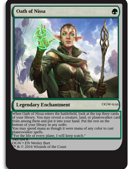
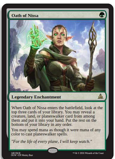
Aaaaand here it is! A Magic: The Gathering card made in HTML and CSS
You can check the entire code below:
Now, if you coded along throughout the entire article or read up until now (or did both, which is the best I can hope for) I want to say two things:
- Thank you from the bottom of my heart, you can’t imagine how this means to me!
- Congrats!

✉️ Subscribe to CodeBurst’s once-weekly Email Blast, 🐦 Follow CodeBurst on Twitter, view 🗺️ The 2018 Web Developer Roadmap, and 🕸️ Learn Full Stack Web Development.

