Modals in React
Modals in React are much like Icons in React. There’s plenty of ways to implement them, and there is no single correct way.
Having said that, the below is the correct way :)
Edit: React 16 came out today with support for “portals” which may make a lot of the below redundant. Maybe one day I’ll update this post. Maybe I won’t. On with the show…
Firstly, this is what I need my modal to do:
- Look and behave roughly the same everywhere
- Handle things like mouse events and keyboard shortcuts for closing
- Accept some callbacks for when the user clicks OK or cancels
- Allow me to customize width, title text, and a handful of other things
- Make the store and actions available to whatever I render in the modal
Picture time
Here’s some of my modals so you have an idea of the variety.


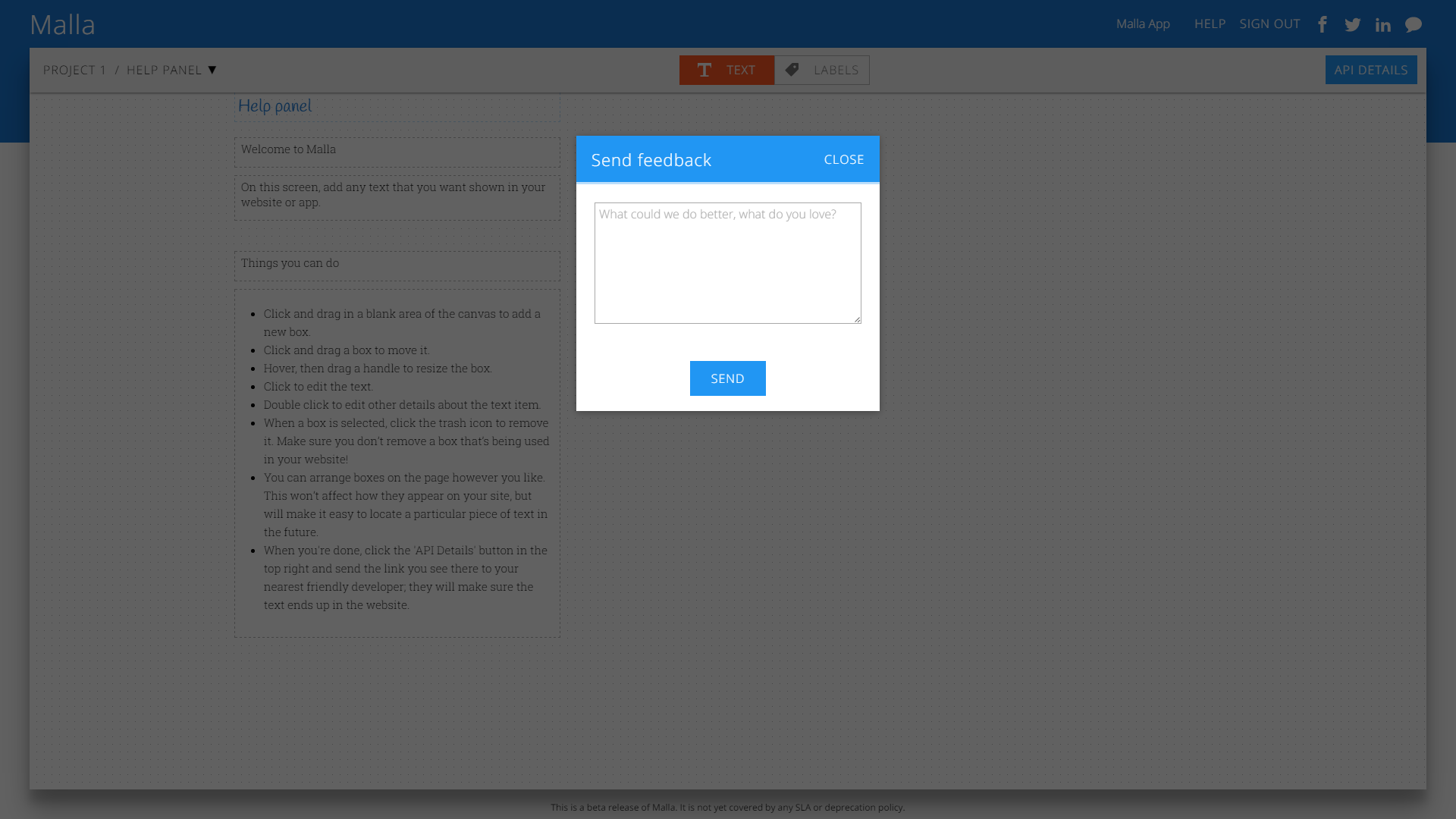
You get the idea. Big black background. The same header and close button styles, but different text. Sometimes a button at the bottom, sometimes not. And varying widths.
The contenders
In my mind, there are three ways to approach modals in React:
- Use a modal component as a wrapper (like a button component) and include it wherever you trigger the hide/show of that modal.
- The ‘portal’ approach that takes a modal and attaches it to document.body.
- A top level modal component that shows different contents based on some property in the store.
Now the downsides, in order:
- Positioning. If you’re using this method and haven’t yet suffered from the stacking context blues, bookmark this page and go about your day. (If you believe that position: fixed is relative to the viewport, you have been lied to).
- It’s a pain to test. It’s a pain to do animations on. And it just feels so hacky; you have a big beautiful React app composed of components, then this one weird trick that uses document.body.appendChild() to mount a portal created with ReactDOM.unstable_renderSubtreeIntoContainer().
I mean, it has the word ‘unstable’ right there in the method name. - Number three is perfect.
The components
This is the component hierarchy.
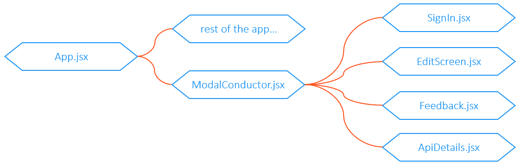
- App.jsx — this is the root of my app, nothing unusual here. It renders any top level components and at the bottom renders the component that renders the modal.
- ModalConductor.jsx — this simply decides which modal to render based on a value in the store.
- SignIn.jsx, EditScreen, etc. — these components output the dom for the actual modals.
The store
Is the store, we have a property called currentModal that contains a string that identifies which modal to show. If it’s null, no modal will show. This of course means we can only have one modal showing at a time.
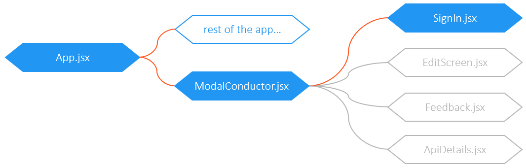
The flow
Let’s say a savvy user clicks the “Sign In” button [clever user for selecting Malla for all their text management needs]. This sets the currentModal property in the store to signIn. That’s all it does.
ModalConductor.jsx has a switch statement in it, so when it sees that the currentModal is now signIn, it renders the SignIn.jsx component, and the user sees the sign in modal.
Here is a simplified version of ModalConductor.jsx.
You can see the concept is dead simple (barely worth a blog post).
Let’s see what one of the modal components looks like. (Note that these examples are missing styling to keep things simple.)
This is kinda simple in principle. Note that the top level of the returned DOM is a component called ModalWrapper which describes the modally parts of the modal, while SignIn.jsx defines what goes inside the modal (in this case, one <p> and three <button>s). SignIn.jsx also sends some properties into the ModalWrapper such as the title and width. Other modals might pass down a callback to handle the user clicking OK.
If you’re new to React this might be a little mind bending at first. The ModalWrapper component is a child of SignIn, but when the DOM is rendered, it’s a parent of the sign in content because SignIn passes those elements in as children of the ModalWrapper component.
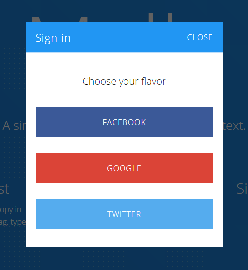
The end result:
Now let’s look at a simplified version of the ModalWrapper component.
If we look at the the DOM being returned we can see that it handles the wrapper and the header and the close buttons, and injects {props.children} right in the middle. It also handles clicking on the background (the black backdrop) to close the modal.
This last part might raise the question “where does the hideModal method come from?”
A tremendous question. Let’s go back to the first component: ModalConductor.jsx — because in addition to deciding which modal to render, it also connects to the store and sends in all my actions (I’m using Redux).
If the idea of sending down the whole store to all modals makes you a little queasy and you want to add some complexity to your app, you could add a ‘container’ component for each of your modals. (At some point I will mount my campaign to have them renamed from ‘container’ components to ‘connector’ components, but since this one decides which modal to show I’m sticking with ‘conductor’).
The setup is all fairly simple but is powerful nonetheless. For example if you want to disable the OK button when some condition is met, you can just down a ‘disableButton’ prop. For example, in Malla you can define the ID for a text field. This becomes the property name in the JSON that the API returns, so must match a pattern. If the ID isn’t valid, the user should not be able to save.

So in the BoxDetailsModal we simply test the validity of the ID, set a flag in the state, and pass that down to the modal component as the okDisabled property.
That’s a wrap!

✉️ Subscribe to Codeburst’s once-weekly Email Blast, 🐦 Follow Codeburst on Twitter, and 🕸️ Learn Full Stack Web Development.

