My journey to making styling with Material-UI right

Material-UI is a React-based UI libraries that implement Google Material Design. It’s very popular among other great UI libraries such as Semantic-UI-React and React Bootstrap.
The real power of Material-UI (will call it MU for short from now on) lies in its flexibilities. What I mean by this is they provide a whole bunch of different options of getting your job done. For example, basically, you are given 3 different ways to style your components.
- Use hook-based api (makeStyles/useStyles)
- Use styled-components api (styled(Component)({…stylesObject})
- Use HoC (withStyles(styles)(Component)
Multiple options guarantee you will always find the most appropriate way to style your components with ease.
In this post, I am not gonna discuss where and how you should use each of these apis but walk you through the process for component styling. The official doc lacks the step-by-step guide as to how you should style complex components like TextField which is composed of children components/elements.
To illustrate, I will choose to use <TextField> as an example and cover how you can style it based on its different states — focused, hover etc.
Let’s start!


The above screenshots show how an outlined textfield look like when being rendered in different states — initial state and focused. Now make some changes to its styles:
- Make border red when it’s being hovered over
- Make border green when users start typing — focused
You might wonder isn’t it as simple as create styles with a class name and apply it to the component by using className property since every MU component accepts this property to allow styles overwriting? Well, the answer is yes and no. For some simple components that does not have much constitutional React elements we can use className. For TextField in our example, className will not help. Let me show you what happens when using className.
const useStyles = makeStyles(theme => ({
  textField: {
    marginLeft: theme.spacing(1),
    marginRight: theme.spacing(1),
    border: '1px solid red',
  },
}));function App() {
  const classes = useStyles();return (
    <TextField
      id="outlined-name"
      label="Name"
      className={classes.textField}
      margin="normal"
      variant="outlined"
    />
  );
}
Now, I’ve attached class textField with borderColor being red to TextField and it makes a red border around the TextField but is not what we want.

Why is that? Inspection on the control tells us that the class textField is actually applied to the root element of TextField which consists of sub components/elements.
Key point: className is ONLY applied to the root element of MU components.

Mission 1 — Make border red when it’s being hovered over
As TextField docs indicate that OutlinedInput will be rendered when variant valued outlined and prop InputProps on TextField can be used to pass any props through to OutlinedInput. It rings the bell!!
Looking at OutlinedInput docs, it has a quite number of class names that allow you to control its styling. Question here is which class should we look at?
To work this out, my trick is hover through DOMs as shown in the above screenshot until you see any highlighted DOM exactly covers the text field. In our case, it’s the div with classes —MuiInputBase-root, MuiOutlinedInput-root and Mui-focused Mui-focused MuiInputBase-formControl.
Now, it becomes more clear that we need to overwrite styles in root class.
However, we will see two borders overlapping each other if we do this:
const useStyles = makeStyles(theme => ({
  outlinedRoot: {
    '&:hover': {
      border: '1px solid red',
    },
}));...const InputProps = {
    classes: {
      root: classes.outlinedRoot,
    },
  };return (
    <TextField
      id="outlined-name"
      label="Name"
      className={classes.textField}
      margin="normal"
      variant="outlined"
      InputProps={InputProps}
    />
  );
}
What’s happened was we added border to div shown as makeStyles-outlinedRoot-2but its children fieldset has its own border in grey that’s overlapping div's one and is highlighted when being hovered over.

Now, it points us to fieldset and we need to find a way to overwrite border-colorvalue:
.MuiOutlinedInput-root:hover .MuiOutlinedInput-notchedOutline {
   border-color: rgba(0, 0, 0, 0.87);
}
A translation from css to jss(mui flavor) is like this:
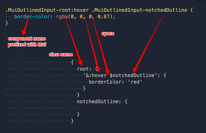
Here we use $ruleName notchedOutline as part of our selector to target the DOM. Let’s reflect it in code and see the effect:
const useStyles = makeStyles(theme => ({
  outlinedRoot: {
    '&:hover $notchedOutline': {
      borderColor: 'red',
    },
  },
  notchedOutline: {
  }
}));...const InputProps = {
    classes: {
      root: classes.outlinedRoot,
      notchedOutline: classes.notchedOutline
    },
  };
which compiles into:
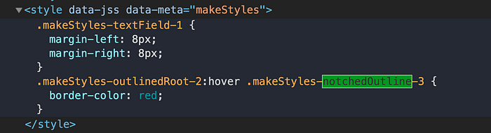
If we now hover over the text field, border colour finally becomes red. Mission one completed!
Let’s look at mission 2.
Mission 2— Make border green when users start typing — focused
Likewise, we can follow the same path to get this mission done easily.
Firstly, figure out what classes fieldset is using when it’s being focused:
.MuiOutlinedInput-root.Mui-focused .MuiOutlinedInput-notchedOutline {
    border-color: #3f51b5;
    border-width: 2px;
}
The selector has a new member Mui-focused compared to the previous one and based on the translation we’ve worked out before we can quite easily write code below to find the target and overwrite the border-color to make it green.
Tip: If you get annoyed by losing focus on input when you click your mouse elsewhere than input itself, you can simply remove blur event from event lists displayed under Event Listeners tab.
const useStyles = makeStyles(theme => ({
  outlinedRoot: {
    '&:hover $notchedOutline': {
      borderColor: 'red',
    },
    '&$focused $notchedOutline': {
      borderColor: 'green',
      borderWidth: 1,
    },
  },
  notchedOutline: {},
  focused: {},
}));
And don’t forget to add focusedto classes prop:
classes: {
  root: classes.outlinedRoot,
  notchedOutline: classes.notchedOutline,
  focused: classes.focused
},
Awesome! We now see border turns green when it’s gaining focus.
I understand it can be a tough time for beginners to get styling with material-ui right and hope this post can help them conquer it.
😜😜😜

