Sharing React Components Between Different State Management Libraries
Build and share React components that can be used by Redux, MobX, Recoil, or any other state management libraries.

As you develop your React application, you may find that sharing components between multiple applications and projects isn’t so simple. Here are some problems that you may come across:
- You need to make sure the components are well documented to help other developers understand how to use them.
- You need to visualize the component so that other developers know what the component UI looks like
- You need to decouple the component from any state management libraries to enable maximum scaling potential.
The third point is especially important because React has a collection of third party state management libraries that could be integrated with it.
For example, when Facebook announced the release of Recoil as yet another state management library for React, Dan Abramov (the creator of Redux) tweeted the following wisdom:

When you have a giant codebase just like Facebook does, you will find that different teams in your company use different techniques to solve their challenges.
One team will use Redux because it works well for their case, while the other will find Recoil works best for the problem they are trying to solve. Still, others will want to use MobX because it’s the perfect solution for their case. You will never know what new technology is used together with your components next.
In the middle of all these dynamic changes, how do you create a robust library of components that are flexible enough to work with any other React state management libraries out there?
This might be a hard problem to solve at first, but if you look around, you will find clues to help you develop a reusable components library: It all depends on the kind of mindset you have when you approach this task.
Treat your component as an NPM package
As a React developer, you must be familiar with the routines of trying out new libraries by using npm install . To create share-able React components, you need to start treating them as one of those libraries that you install so frequently.
A good NPM package will be reused across many projects with a variety of use-cases, so looking at one will give you a better understanding of how to share your code.
For example, when I try out React Spectrum, I used to look at the documentation of its components. If I want to create a shared button component, I could look at the documentation of Spectrum’s Button. From there, I notice that the button can be manipulated by providing specific props. Some of them are:
- The
variantprop will affect the visual style - The
childrenprop will be treated as the button text - The
onPressevent is similar toonClickevent, although it has more nuance likeonPressStartandonPressEnd
From this component alone, I can draw a conclusion that a good reusable component exposes its props as APIs. The component may contain state values internally, but developers who use the component don’t need to be aware of it.
With this information, I can create my own Button component with a much simpler API. Here’s an example:
import React from 'react';
import styled from 'styled-components';
import PropTypes from 'prop-types';const Button = styled.button`
  cursor: pointer;
  background: ${props => props.isPrimary ? "cornflowerblue" : "white"};
  color: ${props => props.isPrimary ? "white" : "cornflowerblue"};
  font-size: 1em;
  margin: 1em;
  padding: 0.25em 1em;
  border: 2px solid cornflowerblue;
  border-radius: 3px;`;const StyledButton = ({
  children,
  onClick,
  isPrimary
}) => (
  <Button isPrimary={isPrimary} onClick={onClick}>{children}</Button>
)StyledButton.propTypes = {
  /**
   * The button content or label
   */
  children: PropTypes.node.isRequired,
  /**
   * on click function
   */
  onClick: PropTypes.func.isRequired,
  /**
   * style: primary button or not
   */
  isPrimary: PropTypes.bool,
};StyledButton.defaultProps = {
  isPrimary: true
};export default StyledButton;
The Button component above used styled-components for the visual style and it has three props:
childprop for the Button textonClickprop for the function to execute on clickisPrimaryprop to change the visual style of the component
You can see a live demo here:
Now, I will test to see if I could use this button together with Redux. Turns out, I can still use Redux along with my newly shared button component just fine. The key is to send state data from the Redux store into my component’s props to affect its output.
In the following example, I saved the isPrimary value in a Redux store and use it to manipulate the button component. When the button is clicked, I can send a dispatch to toggle the state from true to false:
function App() {
  const isPrimary = useSelector((state) => state.isPrimary);
  const dispatch = useDispatch();const title = isPrimary ? "Primary" : "Secondary";return (
  <StyledButton
   isPrimary={isPrimary}
   onClick={() => {
    dispatch({ type: "TOOGLE_BUTTON", payload: !isPrimary });
   }}
  >
  {title}
  </StyledButton>
  );
}export default App;
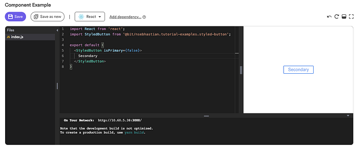
Here’s a live demo for you to inspect:
And here’s another example with MobX implementation:
The implementation detail of state managers will obviously vary between projects. When sharing React components, think of how your component will work flawlessly as long as the right props are supplied into it. That way, you can create a decoupled component to share across many projects and serve different use-cases.
But all of this is just solving the third problem of sharing React components, which is to decouple the component from any state manager. You still need to document, track, test, and visualize your components to create a robust sharing workflow. Don’t worry, this is where Bit comes to help you out.
Using Bit as your component library platform
If you look at the example button component above, you will be able to see the preview of my component being rendered in the browser. You can even edit the props inside the editor and the change will be rendered live into the box:
This is Bit’s live playground, where you can see your component in action. And just below that, you’ll find the documentation of the properties available for this component:

The documentation is automatically generated when you use PropTypes inside your component.
All of this looks amazing, but what is Bit exactly?
Bit is a component collaboration platform that enables you to share components between different projects and repositories. It’s a very handy tool that handles registering, testing, updating, and installing your components.

If you want to learn more about Bit, I have written some tutorials on how to share components between Next.js projects, or even between React and React-Electron.
Conclusion
Creating a collection of components that can be reused across many projects and support different use cases is definitely one of the biggest challenges for any developer team.
Luckily, you don’t need to think of a good code pattern for sharing components from scratch. You can take a look at your favorite libraries, read the documentation, and inspect its source code, and you can take the pattern you find to create your own.
Expose your component’s props as APIs and decouple the need for state management libraries as much as you can. By doing so, you will enable maximum scaling potential for your components.
Finally, check out Bits reusable components guide to get you started on creating a reusable components library for React. Thanks for reading!

