The Challenges of Responsive Web Design
Exploring what had appeared to be a settled issue; proposing another pattern.

Responsive Web Design
Since it has been a few years since we were all talking about responsive web design, let us remind ourselves what it is.
Responsive web design (RWD) is a setup where the server always sends the same HTML code to all devices and CSS is used to alter the rendering of the page on the device…

Responsive design serves all devices with the same code that adjusts for screen size.
— Google — Responsive Web Design
Why We Like It
Let us first consider why we like it.
Makes it easier for users to share and link to your content with a single URL.
Helps Google’s algorithms accurately assign indexing properties to the page rather than needing to signal the existence of corresponding desktop/mobile pages.
Requires less engineering time to maintain multiple pages for the same content.
Reduces the possibility of the common mistakes that affect mobile sites.
Requires no redirection for users to have a device-optimized view, which reduces load time. Also, user agent-based redirection is error-prone and can degrade your site’s user experience (see Pitfalls when detecting user agents” section for details).
Saves resources when Googlebot crawls your site. For responsive web design pages, a single Googlebot user agent only needs to crawl your page once, rather than crawling multiple times with different Googlebot user agents to retrieve all versions of the content. This improvement in crawling efficiency can indirectly help Google index more of your site’s content and keep it appropriately fresh.
— Google — Responsive Web Design
For web sites (content focused), the arguments for responsive web design are pretty overwhelming; it just solves a lot of problems.
While only one of the arguments above, requires less engineering time, is fully applicable to web applications (workflow focused), it is easy to be lured into a responsive web design approach.
So What is the Problem?
I have long held the opinion that responsive web design is the best approach for all web sites / applications. Just over a month ago, however, I ran into a design problem that challenged this opinion.
Here is a snippet from the longer article that I wrote:
The autocomplete select input, as the name suggests, is a hybrid of a select and autocomplete search input. A classic example of this is selecting the origin and destination for flights, e.g., Google Flights on the desktop:

On iOS (iPhone) it looks like this:
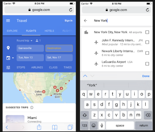
— John Tucker — Autocomplete Select Inputs on Mobile
Observations:
- In this web application, the desktop and mobile design solutions to the autocomplete select input are radically different; on the desktop it is a pull-down list and on mobile it is a completely new screen
- The onscreen keyboard, combined with the limited screen height, on mobile makes a pull-down virtually impossible to use. As a matter of fact, select inputs automatically render as pull-downs on desktop and as modals on mobile (on both iOS and Android)
- The fundamental difference between the two design solutions makes it a difficult engineering problem to implement them as a single technical solution
- There is a bit of irony that this example, Google Flights, is a Google product
Opening the Flood Gates
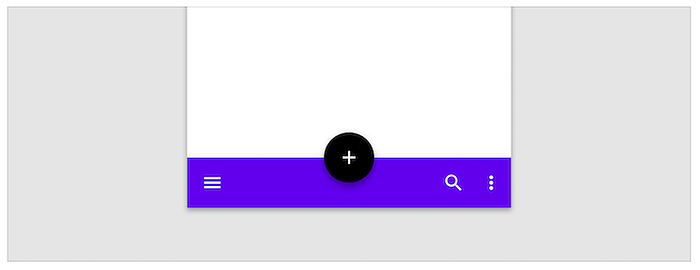
Once I was open to the idea that we might want to create fundamentally different design solutions between desktop and mobile, I started to see more examples of this. For example, many iOS applications have a Tab Bar that is distinctly a mobile design.
Two Design Framework’s Take on the Topic
Unsurprisingly, Google’s design framework, Material Design, adheres to the responsive web design approach.
Material Design maintains the same UI across platforms, using shared components across Android, iOS, Flutter, and the web.
— Material Design — Introduction
Interestingly, Material Design, does intermittently introduce exceptions to this approach, e.g., they specify a mobile-only App Bar.
The relatively newer Ant Design framework, provides two entirely different solutions between desktop and mobile.
- Ant Design: Ant Design’s flagship offering that has a distinctly desktop feel
- Ant Design Mobile: Ant Design has a lesser known, and little rougher around the edges, mobile-only solution
Challenges with Two Design Solutions
Say we are using two completely different design solutions for desktop and mobile, e.g., we are using Ant Design’s libraries; there are two approaches that we can take.
We can create two different applications; one for mobile and one for desktop. The challenges here are how to:
- Direct the user to the right application
- Avoid code duplication, e.g., the data and business logic, between them
We could also create a single application and programmatically switch out components between desktop and mobile. The challenge here is to avoid having a poorly performing, bloated, application; i.e., carrying around code for both desktop and mobile.
The Best of Both Worlds
One of the lesser understood features of modern web application development is code splitting.
Bundling is great, but as your app grows, your bundle will grow too. Especially if you are including large third-party libraries. You need to keep an eye on the code you are including in your bundle so that you don’t accidentally make it so large that your app takes a long time to load.
To avoid winding up with a large bundle, it’s good to get ahead of the problem and start “splitting” your bundle. Code-Splitting is a feature supported by bundlers like Webpack and Browserify (via factor-bundle) which can create multiple bundles that can be dynamically loaded at runtime.
— React — Code-Splitting
With code splitting, we can easily load different components based on the environment (desktop or mobile) and share common code without the performance penalty of having unnecessarily large bundle sizes.
A Working Example of Code Splitting with Two Design Libraries
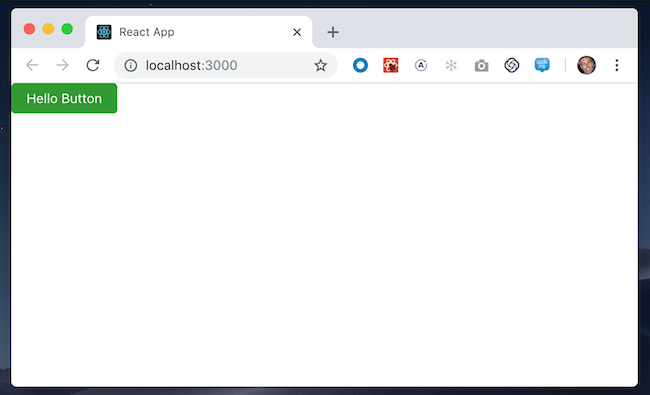
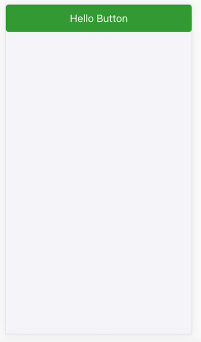
To demonstrate this approach, specifically with Ant Design and Ant Design Mobile, I created a simple example. This example uses the Ant Design Button component when run on a desktop:
And the Ant Design Mobile Button on mobile
Inspecting the bundles we have the following:
Common Between Desktop and Mobile
- runtime~main.96bfae96.js (3.12 KB): Application
- main.fb445a75.chunk.js (1.5 KB): Application
- 5.3ddca9df.chunk.js (114.75 KB): Vendor Libraries, e.g., React
- 0.f0876085.chunk.js (18.53 KB): Babel Core
Additional Bundles for Desktop
- 2.fb734486.chunk.js (273 B): Application
- 4.9dd7575f.chunk.js (516.21 KB): Vendor Libraries, e.g., Ant Design
Additional Bundles for Mobile
- static/js/3.5a0b0e9a.chunk.js (275 B): Application
- static/js/6.6b8e79a9.chunk.js (15.65 KB): Vendor Libraries, e.g., Ant Design Mobile
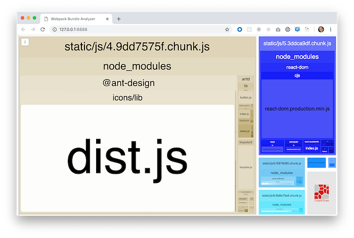
Observations:
- There is an issue with the current release of Ant Design that has all the SVG icons being included in the bundle; even if you are not using any / all of them. Thus the extra large desktop vendor bundle. For simplicity, I did not implement the suggested work-arounds
- In this implementation, the application only loads one of the additional desktop or mobile bundles
- This examples uses the react-loadable library for code splitting
- Instead of using react-app-rewired, as suggested in the Ant Design documentation, this example uses a custom Create React App implementation that supports Ant Design and Ant Design mobile. Customization is based on an approach documented in the article Customizing Create React App — Done Right.
Conclusion
While I am not 100% sold on merit of the Ant Design Mobile library, again it is a little rough around the edges, I am convinced that by using code splitting, we can effectively supplement our responsive web design approach and create applications that are fully optimized for both desktop and mobile.
