Tutorial: Three Awesome CSS Hover Transitions & Animations for Beginners
Step up your web design with just a few lines of CSS.

CSS doesn’t have to be scary. Here are three (super simple) transitions you can add to a web app with just a few lines of code.

Project Setup
For this project we’re going to be applying our transitions to a <div> element with a class of box. Our box will have some text centered in the middle of it. The HTML is pretty simple:
<div class='box'>
  <p>TEXT</p>
</div>
Our CSS is also pretty simple. We want to use a sans-serif font, and ensure that the paragraph text within our div is white:
body {
  color: white;
  font-family: Helvetica, Sans-Serif;
}
We’ll apply the following to our box class:
.box {
  width:200px;                 /* Set the Width of box          */
  height:50px;                 /* Set the Height of box         */
  background:#424242;          /* Dark Grey Background color    */
  transition:all 0.25s ease;   /* Transition settings           */

  display: flex;               /* Use Flexbox on P              */
  align-items: center;         /* Center P                      */
  justify-content: center;     /* Center P                      */
  margin: 10px;                /* Apply a margin around our Box */
}- If you’re unfamiliar with the
transitionCSS Property, it does three things. First, we set it to apply toallchanged properties. Then we set the timing duration to.25seconds. Finally, we set the animation timing function toease.easesimply means the animation starts slow, goes fast, then ends slow.
Awesome, everything is set up and ready for us to add transitions to. Here’s what your div should look like thus far:

1. The Fade
First up, adding a fade transition! Create a new div element and add the class fade to it:
<div class='box fade'>
  <p>FADE HERE</p>
</div>
Now all we have to do is add in a hover rule to our fade class. In order to do this, we’ll use the CSS Selector :hover. This selector can be used on all elements, and activates the CSS declarations when the element is hovered on. In this case, we’ll use the :hover selector to change the opacity of our div to 0.5:
.fade:hover {
  opacity: 0.5;
}
That’s it. It’s that easy to add a hover effect to a div. Here’s what it looks like. You’ll see that because of our box property we added at the beginning: transition:all 0.25s ease;, we get a nice fading effect:

2. Add color
Adding a color transition is very similar to adding a fade transition. First, create a new div element and add the class color to it:
<div class='box color'>
  <p>COLOR HERE</p>
</div>
We’ll also be using the :hover selector, but this time we’ll be changing the background color on hover:
.color:hover {
  background: #FF5722;
}
And here’s the effect:

3. The Wiggle
Last but not least, the wiggle! This effect is actually a bit more complex than the previous two examples. For this example I’ll be introducing @keyframes.
@keyframes — Allow you to control the intermediate steps in a CSS animation sequence.
First, create a div and add the class wiggle:
<div class='box wiggle'>
  <p>WIGGLE WIGGLE</p>
</div>
Next, we’ll create our animation code using @keyframes. We’ll name the animation wiggle. Here’s what our code looks like:
@keyframes wiggle {
  20%  { transform: translateX(4px);  }
  40%  { transform: translateX(-4px); }
  60%  { transform: translateX(2px);  }
  80%  { transform: translateX(-1px); }
  100% { transform: translateX(0);    }
}
Again, the @keyframes allows us to break down our animation and define exactly what happens, and in which order. We use percentages to indicated timing during our animation:
20%— movediv4px (right of its original location).40%— movediv-4px (left of its original location).60%— movediv2px.80%— movediv-1px.100%—divreturns to original location.
Now we can run our wiggle animation by using the :hover selector:
.wiggle:hover {
  animation: wiggle 1s ease;
  animation-iteration-count: 1;
}
We set our animation to wiggle. We want it to last 1 second in total, and we want our animations to ease.
Finally, we only want to run our animation once per hover.
Here is the resulting animation:

Where can I learn more?
Css is amazingly powerful. If this interests you, check out: Master CSS — Learn CSS3, CSS4, Flexbox, Animations, Grids, Frameworks, and More!!
A note about Browser Support
While animations are widely supported in browsers, it is a good idea to use prefixes to ensure older browser support. Take a look at the chart below which shows browser animation support vs. browser support for animations with prefixes:
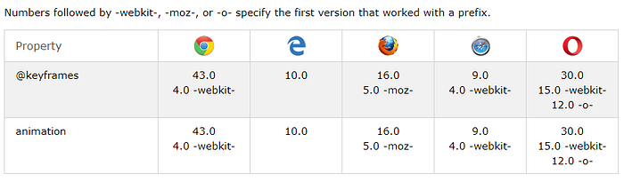
A prefix is simply a way to ensure your animation still works on an older browser. You should always use prefixes when writing CSS animations. Here’s what our wiggle code should look like to ensure maximum browser support:
@-webkit-keyframes wiggle {
  20%  {
    -webkit-transform: translateX(4px);
    transform: translateX(4px);
  }
  40%  {
    -webkit-transform: translateX(-4px);
    transform: translateX(-4px);
  }
  60%  {
    -webkit-transform: translateX(2px);
    transform: translateX(2px);
  }
  80%  {
    -webkit-transform: translateX(-1px);
    transform: translateX(-1px);
  }
  100% {
    -webkit-transform: translateX(0);
    transform: translateX(0);
  }
}@keyframes wiggle {
  20%  {
    -webkit-transform: translateX(4px);
    transform: translateX(4px);
  }
  40%  {
    -webkit-transform: translateX(-4px);
    transform: translateX(-4px);
  }
  60%  {
    -webkit-transform: translateX(2px);
    transform: translateX(2px);
  }
  80%  {
    -webkit-transform: translateX(-1px);
    transform: translateX(-1px);
  }
  100% {
    -webkit-transform: translateX(0);
    transform: translateX(0);
  }
}
And on our :hover:
.wiggle:hover {
  -webkit-animation: swing 1s ease;
  animation: wiggle 1s ease;  -webkit-animation-iteration-count: 1;
  animation-iteration-count: 1;
}
As you can see, the prefixes look the exact same as the other CSS code. The only difference is the addition of the -webkit- at the beginning.
Can I see the CodePen?
Yes, yes you can. Here’s all the code, buttons, animations, in action:
Closing Notes
Thanks for reading! I publish 4 articles on web development each week. Please consider entering your email here if you’d like to be added to my once-weekly email list, or follow me on Twitter.
If you want to improve your CSS Skills, check out Master CSS — Learn CSS3, CSS4, Flexbox, Animations, Grids, Frameworks, and More!
