The CSS flexbox model, popularly known as flexbox is a one dimensional and pretty easy way to distribute space, lay out and align items in a container. After long and tiring(for me!) moments of floating and clearing “both” in my code, I found flexbox to be an absolute relief.
With flexbox, the container has the ability to alter its items’ width and height, order, and can even determine the amount of space a particular item in the container can occupy. Pretty neat, right? I thought so too!
Before I go deeper, I’d like to start with the first important thing to note while using flexbox.
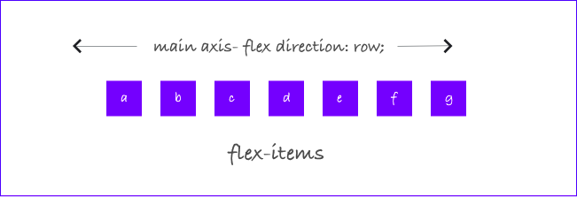
There are two axes in flexbox…the main axis, and the cross axis.

The main axis
The main axis is defined by the direction the flex-items are being laid out. The start and end of this axis are called main-start and main-end. The flex-direction property can determine the direction in which the main-axis is laid out.
In browsers where English is the default language, the items are laid left-to-right in the container. If arabic were my default language for example, my main axis would run from right-to-left.
The row-reverse value lays out the items in the flex container in reverse order.

The cross axis
The cross axis runs perpendicular to the main axis e.g if your main axis is set to flex-direction: column, the cross axis will run along the rows, and vice versa.

Understanding the axes will come in extra handy when you need to arrange items in your container.
Okay, glad we have gotten that out of the way. Next we move to the flex(parent) container, and the items.
I found it easier to understand when I dissected flexbox into properties that can be used on the container, and then, its items. For now, we’d deal with properties for the parent container only, in other to not end up overwhelmed.
So here goes!
The flex container
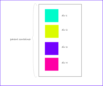
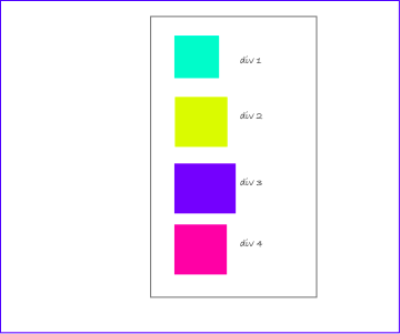
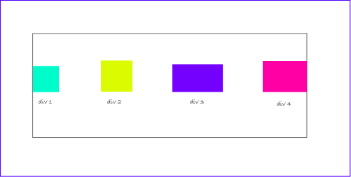
To start using flexbox, you need to first define a flex container. This is the parent element which holds the children in your code. It could be a div, span, nav, etc.

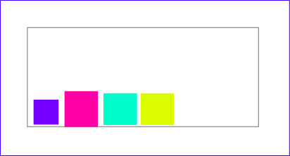
The image below shows the output of your code, before the flex is set to the display property.
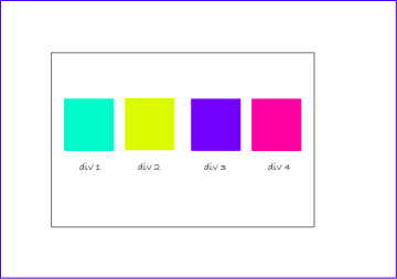
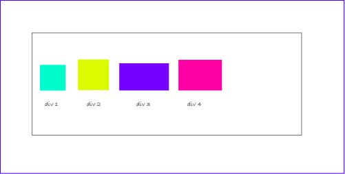
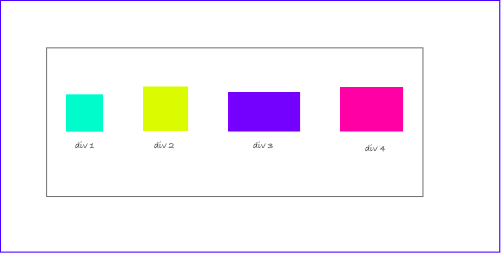
The parent container becomes flexible by setting the display property to flex.

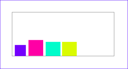
And… voila! This is what you get after applying flex.
You can also set the parent container to display:inline-flex; This will create a flex container that is inline, instead of a block.
I also found out that display:inline-flex; does exist, and this will create a flex container that is inline, instead of block. So…Lucky you :).
The flex-direction property
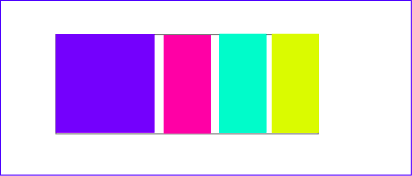
You can decide how you want your items to lay out in your flex container. This can be done with flex-direction.
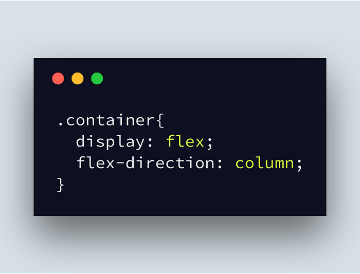
This will cause the elements to stack on top each other. Remember that once you set the value to column, the main and cross axes are switched up.
Other values include row, row-reverse, column, and column-reverse.
The Justify-content and Align-items properties
Distribution of items in the flex container along the cross and main axes are done with the justify-content and align-items properties. Think of moving your items up, down, left or center in your flex container? This is where these two properties come in handy!
Justify-content property
Justify-content distributes the flex items along the main axis in the container.
There are various values we can use with our justify-content property and we’d take them one by one.
- flex-start : default value of items. items are lain out from start of the flex.
- flex-end : items are lain out from the end of the flex.
- center: items arrange in the center of the container
- space-between: items have an equal space between each other, but not between it and the container. In other words, first and last item have no space between them and the container.
- space-around: items have an equal amount of space between them, but the difference in this case is that the first and last item have some space between them are the container. This space is HALF the amount between the two items. E.g a margin of 40px exists between span 1 and 2, so the margin between span 1 and the container is 20px.
- space-evenly: items are distributed evenly in the container, equal amount of space between all.

Align-items property
Align items arrange and distribute items in a flex container along the cross axis. Just like justify-content, it does have various values you can use.
- stretch: default value . items take up entire space in the cross axis.
- flex-start: items are lain out from the start of the flex on the cross axis.
- flex-end: items are lain out at the end of the flex container.
- center: items are lain out in the center of the container along the cross axis.
- baseline: items are aligned in such a way that the baselines are equal.
Align-content property
I used to think align-items and align-content did the same thing, but they do not. align-content works similarly to justify-content, but in this case, it will define space distribution between items on the cross axis.Its values are: space-around, space-between, center, stretch, start.

I like to think that align-content modifies the behaviour of the flex-wrap property, which we will be dealing with next.
Note: There must be multiple lines of items for this property to have any effect!
Flex-wrap property
Sometimes, you don’t want your items to fit all on one line. This means that if you have a set of flex items that are too wide for their container, they will overflow it.You may want to spread them across on multiple lines in the container, and this is where flex-wrap comes in.
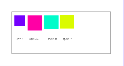
the flex-wrap property allows items in the container to occupy more than one line. the default value of flex-wrap is nowrap. To wrap items, use the wrap value.
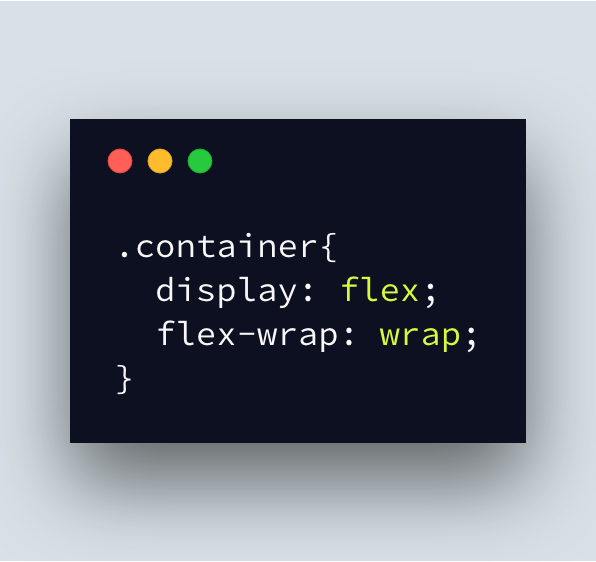
The code above will produce this result.

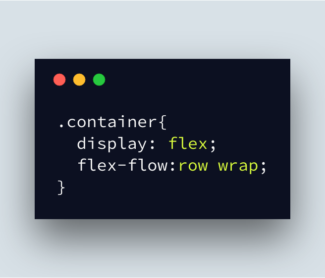
You can also combine flex-wrap with flex-direction for your items using a shorthand property called flex-flow. You can use any of the flex-direction values in flex-flow.
Conclusion
Flexbox is quite powerful, and though we’ve just scratched the surface, you can see how much easier it is to arrange and distribute stuff.
If you want to have fun while still learning further, there are a ton of games you can find online. Flexbox Froggy and Flexbox Zombies are my faves.
Next we will be dealing with flex-items and its properties.
If you’ve enjoyed reading this article as much as i did writing it, please clap numerous times😆 or leave your comments or questions below if you have any 😄.

✉️ Subscribe to CodeBurst’s once-weekly Email Blast, 🐦 Follow CodeBurst on Twitter, view 🗺️ The 2018 Web Developer Roadmap, and 🕸️ Learn Full Stack Web Development.

