Visual Hierarchy — Case study of Netguru.co

Visual Hierarchy helps to organize UI elements in an effective way so that content will be comprehended easily and pleasant to see. Purposeful and successful visual hierarchy is a foundation for a successful product. The way visual components are organized and presented have a great impact on user experience.
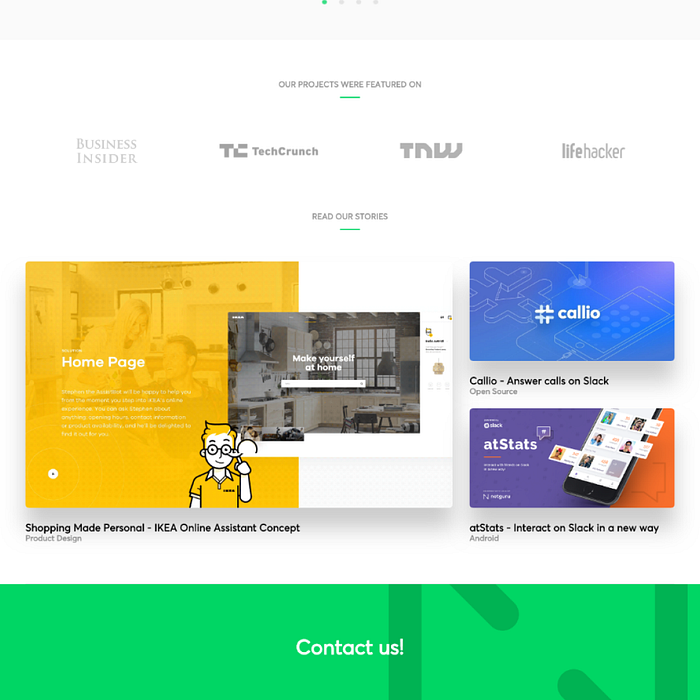
Today’s article illustrates how Visual Hierarchy can be used to create compelling web and mobile products with Netguru’s website as our case study.
Common Fate

Elements moving towards the same direction are perceived as more related than those moving in different directions, or not moving at all.
It helps with grouping relevant information and linking actions with results. It also establishes relationships between different groups or states.
Space (white-space)

Space, especially white space (also called negative space), between website UI elements can also help highlight the UI contents and create visual hierarchy intuitively.
Color & Shadow

Color and shadow can contrast with each other to show the differences between them and help designers stand out the website visual hierarchy.
Furthermore, when overlapping two or more UI elements together, you can also use contrasts to emphasize the top layer elements. Moreover, in case of causing any chaos, you’d better keep the contrasts in balance.
Proximity
Proximity is used for grouping similar information, organising content and decluttering layouts. It’s suggested to closely place logically related UI components in the same place for better readability and clearer layouts.
Related items should be closest to each other while unrelated items should be further apart. Its correct use will have a positive impact on visual communication and user experience.
Conclusion
Visual hierarchy not only makes a website UI beautiful and attractive.It also creates a pleasant experience for the users and a great success for the business and effectively helps UI/UX designers such as myself to perfectly organize the contents of any digital product.
Disclaimer: This is not in any way publicity for Netguru.co but me just using the wonderful work on their website to demonstrate the application of Visual Hierarchy in UI Design. I also do not work for them.
If you enjoyed this article or find it useful, show your appreciation with claps 😉 and share it so more people can benefit from it. ❤

✉️ Subscribe to CodeBurst’s once-weekly Email Blast, 🐦 Follow CodeBurst on Twitter, view 🗺️ The 2018 Web Developer Roadmap, and 🕸️ Learn Full Stack Web Development.