You don’t need CSS to style your webpage!
Say “Hi!” to Tailwind CSS 👋

Are you that someone who gets frustrated whenever you apply those styles you always wanted on your webpage but when you check out on the browser, it just doesn’t work! Ah, I had those moments (and still I see others struggling with this), I’ve been that “someone” for quite long and the only way was to save the project, shut down the lid of my laptop and relax…enjoy everything else but not that stupid browser who can’t render what I want!
Though there’s always a small and stupid mistake(s) we do as a beginner (and even an intermediate level CSS lover), there can be multiple solutions to fix this. We already know we can create magic by including CSS frameworks like Bootstrap or Materialize CSS but you know, you need to learn the new keywords they have for a specific class name(s), and then apply and who knows your project will be exactly the way you wanted?
What now? Enter Tailwind CSS 🌊 with its tail swinging around to make our life as a front-end web developer easy-peasy… 🙌
Who’s this new contender?
Tailwind website calls itself as a utility-first CSS framework. This is because this one is so much customizable, and gives you everything you need to make a webpage in minutes! Coming straight from its website:
Tailwind CSS is a highly customizable, low-level CSS framework that gives you all of the building blocks you need to build bespoke designs without any annoying opinionated styles you have to fight to override.
What sets apart Tailwind is that instead of some predesigned components, it provides low-level utility classes that we can use to completely customize it without using a single line of code of CSS.
To demonstrate the above sentence, we’ll build a quick landing section of a webpage using just the barebones of the framework. Shall we?
What will I make?
This:

What will I need? 🛠️
- H̸a̸m̸m̸e̸r̸ ̸a̸n̸d̸ ̸w̸r̸e̸n̸c̸h̸
- Your already wonderful HTML and CSS skills.
- A text editor. I prefer VS Code.
Ready to NOT create the CSS file?
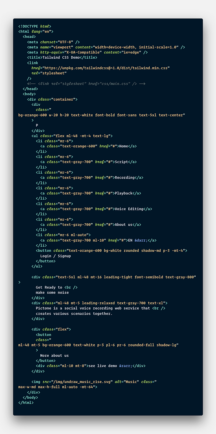
First things first, its time to grab the latest CDN for Tailwind. Add the following tag in your HTML:
<link href="https://unpkg.com/tailwindcss@^1.0/dist/tailwind.min.css" rel="stylesheet">
Wait. I see you’re thinking can install this via NPM and Yarn, but why with CDN? If you install via CDN, you will be shy of the following features:
- ❌ No customization of the default theme.
- ❌ You’re not able to install third-party plugins.
- ❌ You can’t use advanced features like functions, directives or
group-hover.
But, wait! All we’re making is just a simple section of a webpage and we don’t need to run those npm i or yarn add commands to test Tailwind and give it a quick spin.
Okay, you added the CDN and now it’s time to not use CSS, let’s just write one single code file index.html. Ah, did I mention you should delete the following line before proceeding (if you wrote that line)?
<link rel=”stylesheet” href=”css/main.css” />
> The Pictone logo

Add a div with the class container so that Tailwind sets the max-width to match the min-width of the current breakpoint. This will hold all our components. The first one you see if the logo. In a new div we add the following classes with the letter “P” which shows up as the text inside the orangish box:
bg-orange-600: This gives ourdivbackground of orange color with a shade of 600. The equivalent CSS code for this would bebackground-color: #dd6b20;w-20,h-20: By default, the element will stretch to100%of thebody’s width, so we add awidthvalue of5remhere. Same goes for the height, i.e. adding 5rem value to make ourdiva square.text-white,font-bold,font-sans: Here we add three more classes that make our text (“P”) color white, add afont-weightofbold(700) and uses asansfont-familylike Segoe UI.text-5xl: When we writexl, it means extra large. When we write5xl, Tailwind makes thefont-sizeequal to3rem. Do the math.text-center: This is exactly what you thought of. At last, we need tocenterour text concerning thediv.text-align: center;
There you have it! Our first element is complete with just a line of HTML. 😎
> The navigation
Inside the unordered list tag, we have 7 lists and 1 button. Let’s make this. 💪

We start by adding the following classes to ul:
flex: Simple. We need ourliitems to be beside each other. So we make themflexible. What’s good is that it automatically adds equal spacing between all the list items. Rememberspace-between?ml-48,-mt-4: Themlis short formargin-leftand48means we give a margin of12remfrom left to ourul.-mtmeans that theulgets a negative value just likemargin: -2rem;Here we add a top margin of-1rem.
Each of our list (li) tags get a right margin of 1.5rem or mr-6. Inside li, we have anchor tags (a) corresponding to each text element of the navigation with “Home” getting text-orange-600 while the rest text-gray-700 classes.
What’s left is the button, we add the following new classes to look it like above:
rounded: The defaultborder-radiuswill become.25remin value, if we add theroundedclass. We don’t need more radius as per the design, you can surely tryrounded-lgorrounded-full.shadow-md: Next comes the shadow. Themdshadow value tells Tailwind to give ourbuttonabox-shadowof0 4px 6px -1px rgba(0, 0, 0, 0.1).p-3: Thepstands forpaddingand3for adding a.75rempadding across all four sides of ourbuttonso that the text fits in between.
> The left section
Here we have a heading, a sub-heading, and a button. Let’s break them down, one element at a time.
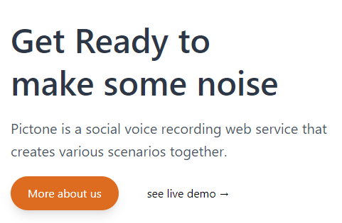
First, we make a div with a leading-tight class. This makes sure that the content inside (which’s our heading text) has a line-height of 1.25. Next, for the sub-heading, we can add the leading-relaxed class which will add a slightly greater line-height of 1.625. Awesome, we’re done with the text, for the buttons, we already know that they stick one next to the other so we add the flex class on a new div. For the primary button, it’s somewhat similar to the one we had in navigation with a slight change that here we add the orange-600 as background-color and make the text white with the necessary margin, padding and border-radius with box-shadow. The text next to it which says “see live demo” is just an anchor tag with 2.5rem left margin and right margin of 2rem.
> The right section
Drumroll 🥁, we’ve come to our very last element of the section. It’s just an illustration from unDraw. You can get whatever image/SVG you like, and inside the img tag, we will have:
max-w-md: This fixes our image to have a28remmaximum width so that it doesn’t come straight to your face.( ̄︶ ̄)↗max-h-full: To make its height100%.
And just like that, you’ve completed coding a nice interface with Tailwind CSS in minutes! 😎
Here’s the complete HTML code:
Where to next? 🤔
Of course, this was just to “get started” and take a quick look of what you can do with Tailwind. You can create complex layouts using advanced features like Components, configurations, extending it with PostCSS and even using Webpack! Everything is listed nicely under its docs, make sure you head over there. For further reading or more in-depth explanation, check out these links:

