Part 2: Bootstrap 4 vs Foundation 6.4 — Responsive Navigation & Containers

Wait! Are you looking for Part 1? Click here.
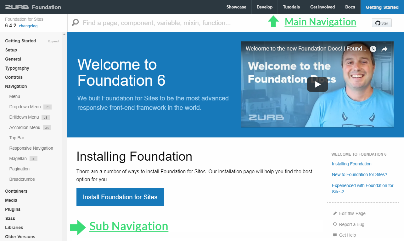
What is Navigation in website design anyway?
Website navigation is the process of helping a user to navigate between the content of a whole website. A navigation structure is one of the most important decisions you have to take up when you are planning a website design and thus it involves a higher level of abstraction than just sketching pages. It helps you organise on how you are going to guide visitors through your content. Placing hurdles in front of the visitors is the last thing you want in your website design and thus a site navigation structure and design always plays a very big role for gaining popularity among your visitors.

There are mainly two types of navigation in a website design:
- Main Navigation: This main navigation includes top level sections/pages of the website and thus would list the main content within a website. It is always better suited that these top level links are common everywhere. In short, it should always look that the whole website was made by a single person (even if this isn’t the case).
- Sub Navigation: After this process, these top level sections/pages contains a local navigation for that specific section which helps the user to navigate most (if not all) pages. Same like main navigation, it is always recommended that these section specific links should be common within the whole section of a website.
Confused? See this image below to clear your confusions.
I am assuming that by now you would have understood what a navigation and sub-navigation actually is and what it does? Now let us compare navigation system’s of the top two open source web frameworks out there. We will cover not only Navigation’s like Topbar/Navbar, Accordion menu, Drill-down menu, Drop-down menu and Off-canvas but also navigable containers like Accordion, Tabs and Pills plus we will also discuss about additional navigation options like Pagination and Breadcrumbs. We will also talk about Responsive Navigation and also how to Prevent Flash of Unstyled Content in Foundation.
Disclosure: I am a Member/Proud YETINAUT of the Open Source Foundation Team but this post has been written without being biased. I have had my shared experience with both frameworks, and all opinions expressed here are my own.
[Base] Navs/Menu’s
Though these base menu’s just don’t give you final products instead they are the structure on the top of which Bootstrap or Foundation creates the common navigation patterns which we will look to discuss later after this base nav/menu section. Its basically the “scratch” from where you can create an awesome navigation system for your website.
Bootstrap 4: Base Nav
Navigation in Bootstrap share a general markup and styles, from the base .nav class for their active and disabled states. You can swap the modifier classes to switch between each style. The base .nav component was built with flexbox and thus provides a strong foundation for building all types of navigation components. Thanks to their Flexbox Utilities, Horizontal and Vertical Alignment are also supported.
Foundation 6: Menu
Foundation’s flexible menu component is an all-purpose component for navigation which helps you build many common navigation patterns, all with the same markup. It replaces Foundation 5’s inline list, side nav, sub nav, and icon bar, and thus unifying them into an all in one component. All versions of the menu are a <ul> filled with <li> elements containing links. Horizontal and Vertical Alignment are also supported.
Navbar/Topbar
Bootstrap 4: Navbar
Bootstrap includes a powerful, responsive navigation header. It also includes the support for branding, navigation, and more, including the support for their accordion/collapse plugin. According to official Bootstrap Docs,
Navbars require a wrapping
.navbarwith.navbar-expand{-sm|-md|-lg|-xl}for responsive collapsing and color scheme classes. Navbars and their contents are fluid by default. Use optional containers to limit their horizontal width. Navbars and their contents are built with flexbox, providing easy alignment options via utility classes. Navbars are responsive by default, but you can easily modify them to change that.
Foundation 6: Topbar
Foundation’s main focus has always been on structure rather than style and rightly so. The top bar is a simple wrapper around foundation’s flexible menu components but supports advanced and responsive layouts. A top bar can have two sections: a left-hand section .top-bar-left and a right-hand section .top-bar-right. On small screens, these sections stack on top of each other. According to official Foundation docs
To set up a Responsive menu with toggle click trigger on mobile, first give your menu a unique ID. Next, add a title bar with the class
.title-barand the attributedata-responsive-toggle. The value ofdata-responsive-toggleshould be the ID of the menu you're toggling. Lastly, adddata-toggleto the element that will trigger the toggle. The value ofdata-toggleshould also be the ID of the menu you're toggling.
Dropdown Menu
Disclaimer: This comparison section shows both vertical and horizontal example for foundation whereas just shows horizontal example because Vertical Dropdown menu or Submenu’s isn’t supported in Bootstrap right now.
Update: Just had a talk with one of the Core Team Member’s of Bootstrap, Johann S and he has ensured me that this will be added in the future, maybe with the first stable release of Bootstrap 4. Cheers!
Bootstrap 4: Navbar with Dropdown
With Bootstrap, you can also utilize dropdown’s in your navbar .nav. Dropdown menus require a wrapping element for positioning, so always be sure that you use separate and nested elements for .nav-item and .nav-link as shown below.
Foundation 6: Dropdown Menu
You can change a basic menu into an expandable dropdown menu with their Dropdown Menu plugin. According to official Foundation docs
Set up: Dropdown menus build on the Menu component’s syntax. Add the class
.dropdownand the attributedata-dropdown-menuto the menu container to set up the dropdown.
Activate: To create dropdown menus, nest a new<ul>inside an<li>. You can nest further to create more levels of dropdowns.
Vertical: Add the.verticalclass to the top-level menu to make it vertical. Sub-menus are automatically vertical, regardless of the orientation of the top-level menu.
Accordion Menu
Unfortunately, this feature isn’t out yet (as of core) within the Bootstrap Framework. That being said, again kudos to Johann S, he has made a quick codepen for using it right now.
Foundation 6.4: Accordion Menu
You can change a basic vertical Menu into a expandable accordion menu with this Accordion Menu plugin. According to official Foundation docs
Accordion menus follow the basic Menu syntax of
<ul>,<li>, and<a>. To convert a basic menu into an accordion, add the attributedata-accordion-menu. You probably also want it to be vertical, so add the class.verticalas well. Any<a>will behave like a standard link. However, any<a>paired with a nested<ul>menu will then slide that sub-menu up and down when clicked on.
Drilldown Menu
Unfortunately, this feature isn’t supported yet within the Bootstrap Framework.
Foundation 6.4: Drilldown Menu
Inspired from Apple iOS drill-down’s, this feature converts a series of nested lists into a vertical drilldown menu. According to official Foundation docs
Drilldowns use the standard Menu syntax, using
<ul>,<li>, and<a>. Adddata-drilldownto the root menu to set up the drilldown. To create sub-menus, place a<ul>next to an<a>. Clicking that<a>will then open the<ul>that it's next to. Any<a>without a submenu will function like a normal link.
Foundation’s Drilldown Menu also supports autoHeight and ScrollTop
Responsive Navigation
Unfortunately, this feature isn’t supported yet within the Bootstrap Framework.
Foundation 6: Responsive Navigation
Foundation’s three Menu patterns as discussed above together form like a Voltron into one responsive Menu plugin, which allows you to switch between patterns at different screen sizes. Confused, here is a video to help you understand the whole scenario.
Let’s start from scratch, the base menu’s have some responsive CSS classes built in, which allow you to re-orient a menu on different screen sizes. Then these menu can be augmented with one of three different plugins—dropdown menu, drilldown menu, or accordion menu. With this awesome responsive menu plugin, you can apply a default pattern to a menu, and then quickly change that pattern on other screen sizes. Some popular menu combination’s (but not limited to) includes:
Please note that I haven’t removed FOUC from these pen’s so that we can understand the issue’s of Flash of Unstyled Content. Now, we will discuss on how to prevent this FOUC issue!
Extra: Preventing FOUC: According to official Foundation docs
Before the JavaScript on your page loads, you’ll be able to see both the mobile and desktop element at once for a brief second. This is known as a flash of unstyled content. There’s not an easy way for the framework to handle this for you, but you can add some extra CSS to account for it. So before the JavaScript loads, we want only the right element for that screen size to be visible.
If you’re using Sass, you can write it like this:
If this doesn’t help, then these Github Threads or filling a new Github Issue are your best bet.
Magellan/Scrollspy
Bootstrap 4: Scrollspy
Scrollspy let’s you automatically update the Bootstrap navigation or list group components based on scroll position to indicate which link is currently active in the viewport. According to official Bootstrap docs
Scrollspy has a few requirements to function properly, It must be used on a Bootstrap nav component or list group. Scrollspy requires
position: relative;on the element you’re spying on, usually the<body>. When spying on elements other than the<body>, be sure to have aheightset andoverflow-y: scroll;applied. Anchors (<a>) are required and must point to an element with thatid. When successfully implemented, your nav or list group will update accordingly, moving the.activeclass from one item to the next based on their associated targets.
Foundation 6: Magellan
Magellan allows you to create navigation that tracks the active section of a page your user is in. You can then pair it with Foundation’s Sticky plugin to create a fixed navigation element. You can use Magellan with any navigation element, like Foundation’s Menu or even your own custom component. You just have to add the attribute data-magellan to the container, and links to specific sections of your page. Please note that each section will need a unique ID. Then, you can use sticky plugin to create a persistent navigation whether its a header or a sidebar.
If there is one thing that makes Foundation’s Magellan > Bootstrap’s Scrollspy, then surely it would be the inbuilt Smooth Scroll. Unfortunately Bootstrap guy’s have been tentative to add this feature in the core as they feel that this can negatively impact things like hardware acceleration. I don’t agree.
Off-canvas/In-canvas
Unfortunately, this feature isn’t supported yet within the Bootstrap Framework.
Foundation 6: Off-canvas/In-canvas
Off-canvas layouts are a very common and useful pattern for both mobile and desktop layouts. The off-canvas panels gets positioned outside of the viewport and slide in when activated. Setting up an off-canvas layout in Foundation is super easy. This pattern is a well established mobile pattern for navigation which can then also be used up to create a responsive sidebar. It is so amazing that it can open from any direction, left, right, top, and bottom. Confused? See this video below.
Unfortunately, it will be hard for me to give you all Off-canvas examples, within one codepen. Your best bet would be to check out this link => http://foundation.zurb.com/sites/docs/off-canvas.html
To explore more you can also check out these visual test cases.
Accordion
Bootstrap 4: Accordion/Collapse
Collapse let’s you toggle the visibility of content with few classes and JavaScript plugins. Using Bootstrap’s card component, you can also extend the default collapse behavior to create an accordion.
Foundation 6: Accordion
Foundation Accordion’s help you to organize and navigate between multiple documents within a single container. They can thus be used for switching between items in the container.
Foundation also support options like Multi Expand and All Closed
Tabs & Pills
Unfortunately, pills isn’t supported yet within Foundation Framework.
Bootstrap 4: Tabs and Pills
You can take the base nav and add the .nav-tabs/.nav-pills class to generate a tabbed interface. You can then use them to create a tabbable regions within your content.
Foundation 6: Tabs
Same like accordions, tabs also help you to organize and navigate between multiple documents within a single container.
Responsive Accordion Tabs
Unfortunately, this feature isn’t supported yet within the Bootstrap Framework.
Added in Foundation 6.3.0, you can now use the Markup of the Accordion or Tabs components to create your very own Responsive Accordion Tabs.
Either the Accordion Markup or the Tabs Markup can be used to responsively switch between the two components within different sizes of a device. Please note that the accordion should have an id specified, but the plugin will automatically generate one if the id is omitted.
Deeplinking (Accordion/Tabs/Magellan)
Unfortunately, this feature isn’t supported yet within the Bootstrap Framework.
Foundation 6: Deeplinking
Tab’s, Accordion and Magellan are great at what they do by default but hey sometimes the content you’re linking to is only linking to the page that the content is on. It might (in some cases) leave your user feeling confused and skeptical. According to Zurb,
It’d be as if you were an Uber driver, dropping your customer off in a sketchy neighborhood they don’t know. It doesn’t matter that it’s only a block away from where they wanted. People want to go directly to where they need to be, so send users directly to the specific content they’re after. When content is hidden in a tab or accordion, a link to the page is not enough. Sure you can link to an id on a piece of content, but the immediate jump to the middle of another page may be jarring and confusing to your users. And what if the content is hidden in a tab that is not open. This is when deep linking comes into play.
Unfortunately, I can’t provide you guys codepen’s for this feature as discussed in the starting of the above video. Thus, I am attaching some Github links for the demo’s where you can see the demo code:
The code for these examples can be found here.
Breadcrumb
Breadcrumb’s help you indicate the current page location within a site by automatically adding separators via CSS.
Bootstrap 4: Breadcrumb
Foundation 6: Breadcrumb
Pagination
Pagination is a type of navigation that helps user to click through the pages of either a search result, eCommerce product list, or other related items.
Bootstrap 4: Pagination
Foundation 6: Pagination
The cool thing about Foundation Pagination compared to bootstrap is that the items in a pagination list are display: inline-block, which makes centering them or aligning it to right side easy. Use their built-in .text-center/.text-right class, or simply add text-align: center|right.
To be continued…
I hope you liked this article. Please check back soon as I will update this series to a 7 Part Article Series for a comparison guide on Bootstrap 4 vs Foundation 6.4 as listed below:
- Part 1: The Grid (September 2, 2017)
- Part 2: Responsive Navigation & Containers (This Article)
- Part 3: Sass Workflow (September 23, 2017)
- Part 4: CSS Only Components (Coming Soon)
- Part 5: Typography & CSS Utility Library (Coming Soon)
- Part 6: Javascript based Components (Coming Soon)
- Part 7: Javascript Plugins and Utilities (Coming Soon)
As a learner, you might worry that these articles will become obsolete when Foundation releases version 7 or Bootstrap releases version 5 and so on… but not to worry, I will update this series with every update so this is a series that should be bookmarked.
Thanks a lot…
- If you liked my article and also my passion for teaching, please don’t forget to follow me and also CodeBurst by clicking the links below.
- If you would like to hire me for your next cool project, or just want to say hello… my twitter handle is @harmanmanchanda for getting in touch with me! My DM’s are open to the public so just hit me up.

